Find the latest news from the Office of Accessibility. Once a month we will bring you tips, articles, and ways to learn more about digital accessibility. Want an easier way to stay informed? Subscribe to the Accessibility Newsletter!
Practical, step by step guidance for effectively describing data viz
12/16/2025 11:56:31 AM
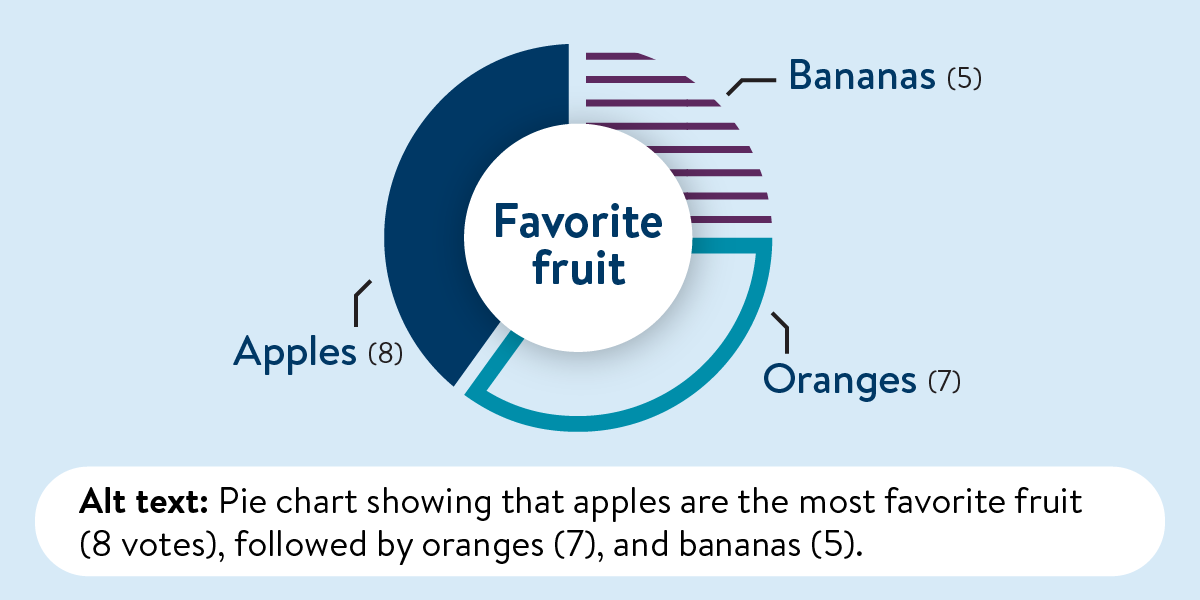
Data visualization presents information in visual formats rather than relying only on text or tables. These visuals can be interactive, allowing people to filter or select categories such as age, gender, or Minnesota county. We typically show results through bar charts, line graphs, maps, and other visual displays that make trends and patterns easier to recognize. Because visuals rely heavily on color to convey meaning, creating them requires careful attention to color use and accessibility.
Data visualizations help people quickly understand patterns, trends, and relationships—but they’re often designed to be seen. For users who rely on screen readers or have limited vision, alternative text (alt text) is essential to make visualizations accessible.
This Tech Tip builds on our December 2025 newsletter article, “Data Visualization Accessibility: Focus on Color,” by exploring how to write effective alt text for charts, graphs, and maps. Whether your visualization uses color to convey meaning or includes interactive elements, alt text ensures that everyone can access the insights—not just the visuals.
Color is often used to convey meaning—but not everyone sees color the same way. If color communicates something important, say so in the alt text.
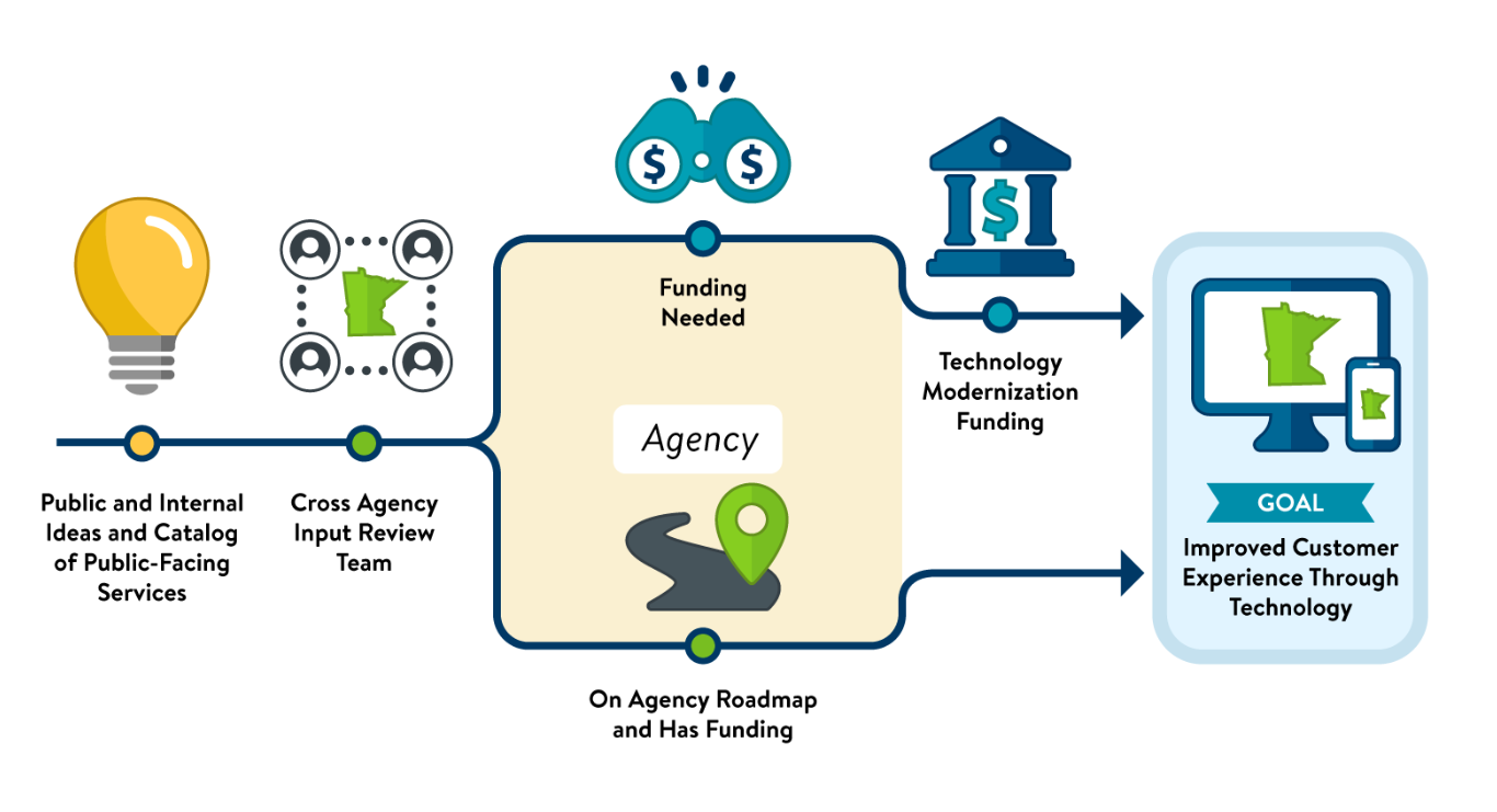
Alt text: A process diagram shows how public and internal ideas move through agency review to determine whether a project funding status. The steps are: 1. Idea submission (from public or internal sources); 2. Initial review by agency staff; 3. Assessment of existing funding; 4. If funding exists, the project proceeds with implementation; 5. If funding does not exist, the idea is evaluated for technology modernization funding; 6. Approved projects move forward with the goal of improving customer experience through updated technology.
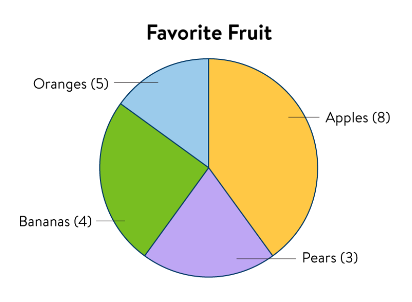
Alt text: Pie chart showing that apples are the most favorite fruit (8 votes), followed by oranges (5), bananas (4), and pears (3).
Digital Accessibility Coordinators (DACs) from across state agencies shared real-world strategies on creating alt text for data visualizations:
Focus on the Data Story: “When we make alt text for data, we are tempted to stay strictly analytical. However, we are usually trying to tell the viewer something by adding complex charts/graphs. The alt text should focus on the story behind the data with reference to more in-depth explanation where applicable.” This aligns with guidance from Dr. Angela Young, a Certified Professional in Accessibility Core Competencies in the Washington/Baltimore area, in storytelling through accessible design.
Practical Alt Text Strategies for Power BI and MS Access: “Add alt text that provides context and highlights the visualization's most important details. The alt text should communicate the main message and be as informative as the chart itself. Alt text should be included for every object that provides meaningful information in the report. When creating the alt text, think about how you would describe it to someone you're having coffee with.” Tips:
And don’t forget: Alt text does not update automatically. If the visualization is revised or updated, you must manually update the alt text to ensure it accurately reflects the current content
Alt text helps make data visualizations accessible to more people—including those who use screen readers or prefer non-visual formats. By describing what the data shows and why it matters, you make your insights available to everyone.
Would you like to learn more about the accessibility work being done by Minnesota IT Services and the State of Minnesota? Once a month we will bring you more tips, articles, and ways to learn more about digital accessibility.
Accessibility
Accessibility
