Make your data visualizations more inclusive—starting with color.
12/17/2025 10:00:00 AM

Content authors: Nancy Rice, Research Scientist, Minnesota Department of Health and Angela Sechler, Business Intelligence Product Manager, Minnesota Department of Health
Data usually consists of numbers and categories. Examples of numerical data are number of people in an area or dollar amounts in a budget. Examples of categorical data are geographic regions (like counties) and types of bills to be paid (like office supplies or food).
Data visualization presents information in visual formats rather than relying only on text or tables. These visuals can be interactive, allowing people to filter or select categories such as age, gender, or Minnesota county. We typically show results through bar charts, line graphs, maps, and other visual displays that make trends and patterns easier to recognize. Because visuals rely heavily on color to convey meaning, creating them requires careful attention to color use and accessibility.
Data visualizations are meant to be viewed, which can create barriers for people with limited or no vision. Without accessible features, these users may not be able to understand or interact with the information. Accessibility also matters for interactive data visualizations.
Not everyone accesses information visually, and people have a wide range of visual abilities. Some individuals are blind, while others may have low vision, color blindness, double vision, or other visual conditions. Even people with full vision may prefer or require non-visual formats, such as using a screen reader to listen to content. Because people interact with information in many different ways, it’s important to apply basic accessibility principles so the data is usable for as many people as possible.
Accessible data visualization involves many considerations. Here, we’ll focus on color and provide a few tips below. For more thorough information, refer to the “Resources” section at the end.
Color can help distinguish elements in a visualization but is not accessible to everyone. Consider how the visualization would look in black and white, or without visual cues at all. Would the information still be clear and understandable?
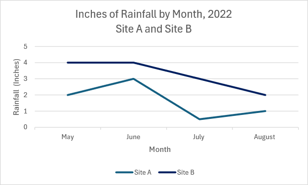
Option 1: The line graph below displays rainfall in inches from Site A and Site B from May to August 2022. The colors of the lines are similar making it hard to distinguish Site A from Site B.

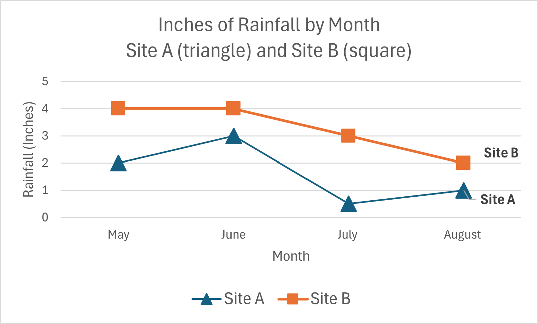
Option 2: The line graph shows the same information as Option 1, but it adds distinct shape markers and clear labels for each line. These changes make the differences easier to see and more accessible to a wider range of users.

Color palettes can be useful, but no palette will work for everyone. To test accessibility, view the visualization in grayscale. If you can’t distinguish between components, others may struggle as well. You can also test color combinations with the Color Palette by Deque.
Explore the resources below to get started:
Would you like to learn more about the accessibility work being done by Minnesota IT Services and the State of Minnesota? Once a month we will bring you more tips, articles, and ways to learn more about digital accessibility.
Accessibility
Accessibility