Understanding Success Criteria 1.4.11 Non-text Contrast
7/20/2022 3:00:00 PM

By: David E. Miller, Minnesota IT Services, Partnering with the Department of Corrections
Since May 1999, the Web Content Accessibility Guidelines (WCAG) have had us thinking about colors. From the start, WCAG told us to use more than just colors to convey information and to use sufficient contrast between foreground and background colors. In December 2008, WCAG 2.0 stated that text should have a contrast ratio of at least 4.5:1 to its background. For those who consume text visually, the contrast ratio is extremely important. It ensures that your eyes can pick out all the lines, curves, dots, and serifs of the text for ease of reading. It makes the text pop.
You may know these guidelines by heart and are subconsciously checking for them daily. WCAG 2.1, published in June 2018, introduced some new guidelines. This article covers one of those additions: 1.4.11 Non-text Contrast – Level AA.
Text of the criterion:
“The visual presentation of the following have a contrast ratio of at least 3:1 against adjacent color(s):
What does this add to WCAG, and how does it apply? The answer to that can be quite complex as the Understanding Success Criterion 1.4.11 page may lead you to believe. Some basic rules will help ensure that those who design, develop, and test digital content adhere to WCAG 2.1.
The simple answer to this question: everything that’s not text, and:
This article will focus on user interface components, which include:
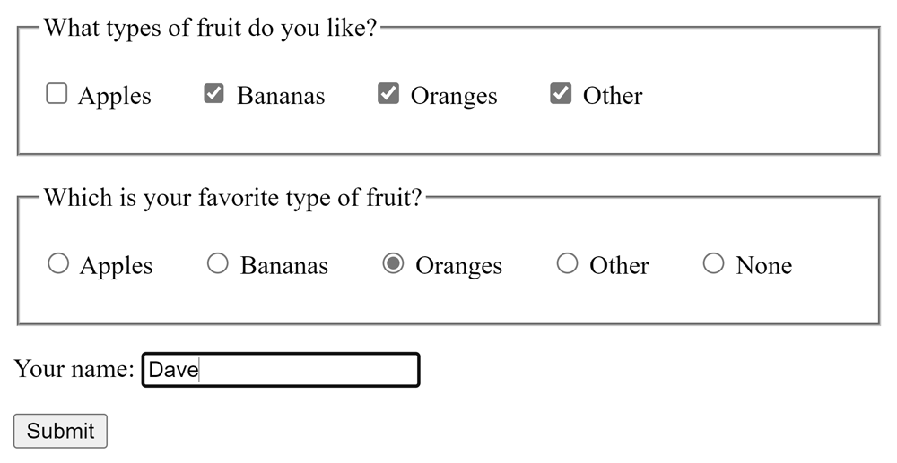
Here is a screenshot of some user interface components rendered in Google Chrome. They use the default styling:

In addition to the text there are:
There are also graphical differences between selected and unselected items.
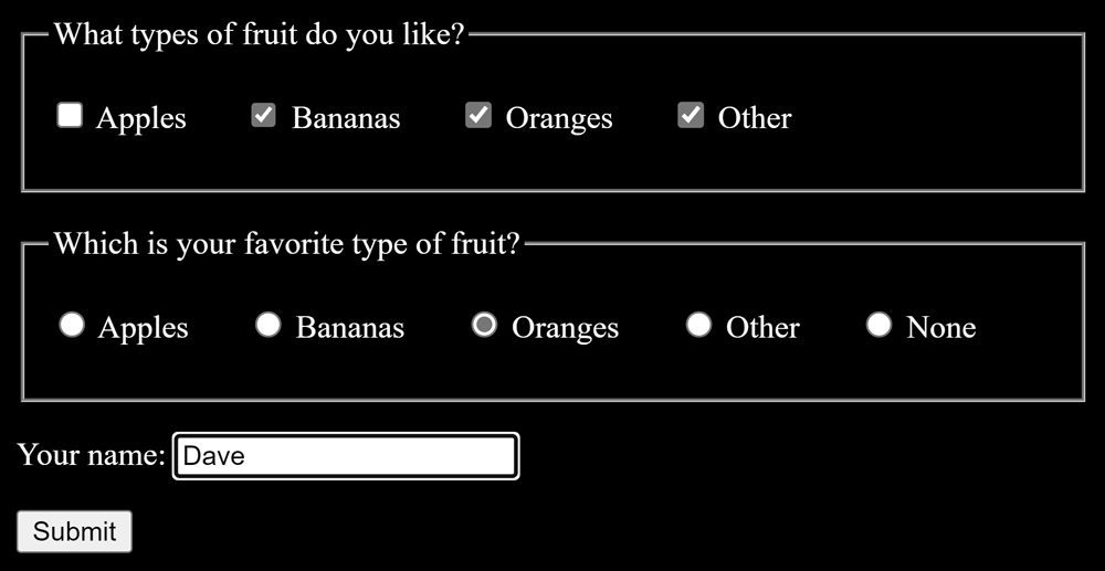
Here are some screenshots of the same input controls with only slight styling changes:


Figure 2 shows what the WCAG 2.1 section 1.4.11 calls user interface components. It also demonstrates the concept that a well-designed user interface component will be visible regardless of the background color. By using simple HTML, you can test this out using a variety of background colors. No matter what background color you choose, the user interface components show up well. By using simple HTML and not overriding how the browser styles user interface components, you’ll get something that’s more than likely accessible. If you start
you’ll need to pay far more attention to how the colors of the controls contrast with their surroundings.
Colors indicate many things – sometimes all at once. Consider the following aspects for components.
If a component does not contrast well with its environment, a user might not notice the control. Good contrast allows a user to see the component in the first place.
The shape of a component often can be a clue to its purpose. Examples include:
Shapes are partly determined by how a component contrasts with its surroundings. If that contrast isn’t strong, users may not understand the shape and purpose of the component.
Think about whether a component is enabled or disabled, selected or not. In the screenshots above, the radio buttons visually indicate a selected state. How? They have a filled circle within the control’s outline. The shape of the main control stands out from the surroundings even though the selection indicator is the same color as the outline of the control. It stands out because a ring of white surrounds it.
When a component has focus it should clearly indicate that to the user. This is typically done by highlighting or outlining. The user can only detect them if the color used contrasts with both the surroundings and the control itself.
When choosing colors for a color scheme, choose one or two colors to use as your background. If picking more than one, they should both be light or both be dark.
When choosing foreground colors pick ones that have at least a 3:1 contrast ratio to the background color(s). Preferably this is a 4.5:1 ratio so they also meet text contrast requirements.
Once you pick colors that have sufficient contrast, it is a good idea for your graphic design to alternate neighboring colors between light and dark. This ensures that the contrast is visible. For the outline of a custom-designed control, consider making it a dark outline with a light-colored center. Better yet, use a double outline of light outside of dark with a light center. This way, all parts will still show clearly whether you place the control over a light or a dark background.
Capturing all of this in specifications can be tricky. The State of Minnesota currently requires WCAG 2.0 Level AA, but you can craft your business specifications to be forward-thinking. If guideline 1.4.11 is important to your business, document that your business specifications should follow WCAG 2.1 Level AA guidelines.
The last specification is important to users who zoom or magnify. It ensures they can still clearly make out details of user interface components. Using raster images (BMP, GIF, JPG, PNG) cannot guarantee that easily.
It can be very useful to show examples of these concepts in the design specification. You can also share the actual user interface you created components using these specifications.
Ideally, check the color contrast of the main design colors while you write the specficiations. This is more efficient and cost-effective than after the team delivers the UI for testing. If the specifications are clear, and there are call outs of the approved design colors, testing is simpler. Testers check:
You can be sure the team followed the specifications by using a browser’s developer tools. They can help with identifying colors and styling.
The guideline calls out two exceptions for user interface components:
“Inactive components, such as disabled controls in HTML, are not available for user interaction. The decision to exempt inactive controls from the contrast requirements was based on a number of considerations. Although it would be beneficial to some people to discern inactive controls, a one-size-fits-all solution has been very difficult to establish. A method of varying the presentation of disabled controls, such as adding an icon for disabled controls, based on user preferences is anticipated as an advancement in the future.”
This article does not discuss the graphical objects portion of the guideline. Many of the color concepts for user interface components can also apply to designing graphical objects. However, the design group also needs to ask additional questions like:
By following a couple of simple concepts, you can help ensure that your creation will adhere to WCAC 2.1, 1.4.11. You will get most of the way by defining background and foreground colors well, and alternating light and dark colors in component design. Alternatively, using HTML-defined objects with no additional styling will also satisfy the guideline. Involve all team members early when you create and approve specifications to make good, accessible design decisions that will benefit everyone.
Would you like to learn more about the accessibility work being done by Minnesota IT Services and the State of Minnesota? Once a month we will bring you more tips, articles, and ways to learn more about digital accessibility.
Accessibility
Accessibility