Create a Tab page
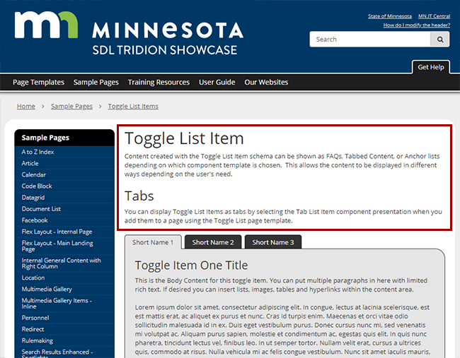
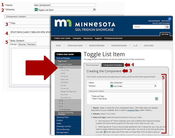
This page contains information on how to create Tab components, plus the other steps needed to create a working Tab page. Sample Page Component Info
Technical Specifications
Below are the types of components that can be used in the Toggle List page template, along with the component templates and number of components for each type that can be inserted in the page.
| Component Type | Accepted Component Templates | Min/Max |
|---|---|---|
| General Content |
|
0-1 |
| Toggle List Item |
|
0-1000 |
| Code Block |
|
0-1000 |


