Article List components
Article List components are the foundation for building an Article List page. They configure how the page looks and which articles are displayed. Article List components can also be used to generate Article Spotlights within Flex Landing Pages.
The Component
-
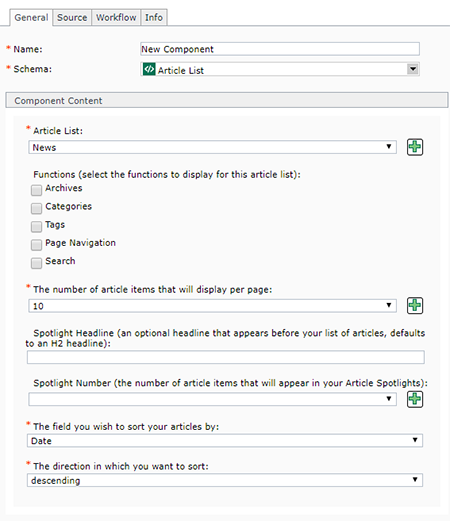
Below are the fields that make up an Article List component, and tips for completing them:
- Name: enter a name for your file
- Schema: select Article List
- Article List: select the Article List keyword. You can only select one keyword, because this is the keyword that you will use to associate individual articles with the page that this Article List component is inserted into.
If your Article List keyword has already been created, then you can select it from the drop-down menu. If you need to create a new Article List keyword, click the green plus icon. This will open a pop-up window where you can create a new keyword. After saving and closing the new keyword, it will appear in the drop-down list for this field and you will be able to select it.
- Functions: check the box for each item that you want to display on your Article List page:
- Archives: if selected, an Archive column will appear on the right side of the Article List page. This column compiles published articles and categorizes them by year and then by month. When a user clicks on a specific month in this column, they will see only the articles published during that month.
- Categories: if selected, a Categories column will appear on the right side of the Article List page. In this column, all categories that have been used in published articles will appear in a list. Users can click the name of a category to see just the articles that have been assigned to that category.
- Tags: if selected, a Tags column will appear on the right side of the Article List page. Similar to the Category column, all tags that have been used in published articles will appear in a list format (users can also click a button to view the tags in a word cloud). Users can click on a tag to see only published articles that have been assigned that tag.
- Page Navigation: this generates the page navigation that appears at the bottom of a list of articles. Generally, we recommend enabling this feature on almost all Article List pages.
- Search: if selected, a search box will appear at the top of the right column on the Article List page. This allows users to search within the article list.
- The number of article items that will display per page: select the number of articles to appear on the page. The options are 1, 2, 3, 4, 5, 10, 15, 20, 25, 50, and 100.
- Spotlight Headline: if this article list component will be used to create spotlights on a flex row page, then an optional spotlight headline can be entered here. The headline displays above the spotlights.
- Spotlight Number: if this article list component will be used to create spotlights on a flex row page, you can select the number of articles to display within the spotlight. The options are 1, 2, 3, 4, 5, 10, 15, 20, 25, 50, and 100. Generally, we recommend 5 or less.
- The field you wish to sort your articles by: the options are Title, Subtitle, Date, Category, and Tag. The most commonly used are Title and Date. When the page loads, it will sort the articles based on the field you have selected, plus the criteria set in the next step (#8).
- The direction in which you want to sort: the options are Ascending and Descending. Ascending sorts from A - Z or 1 - 10. Descending sorts from Z - A or 10 - 1.
Component Templates
-
Article List (default)
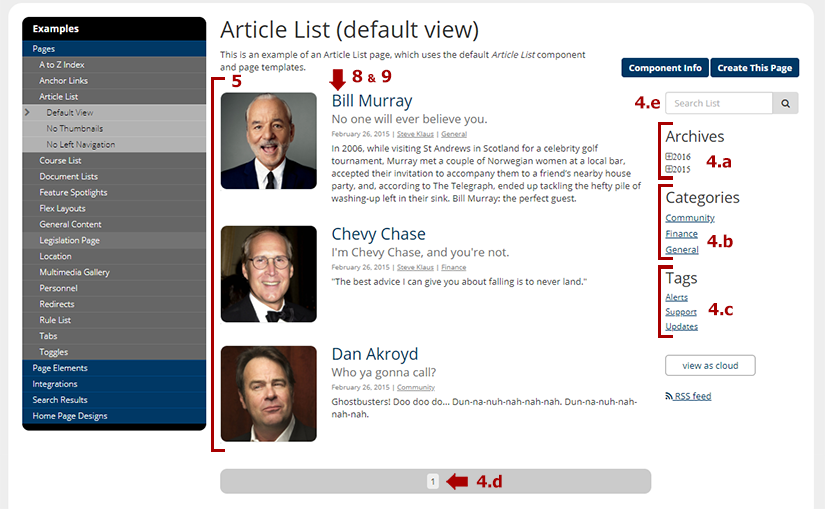
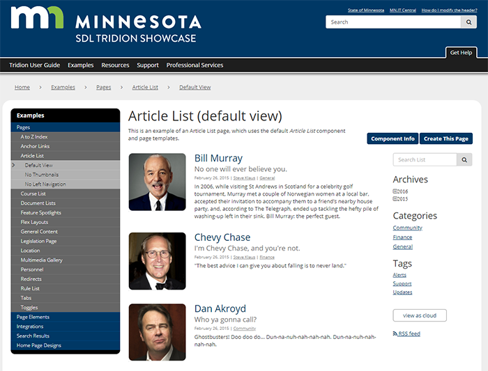
The default Article List component template allows the page creator to control which elements appear on the page, and how they appear. This is what an Article List page looks like with the Article List component template applied, and with all the features (described above) enabled within the Article List component:
Below is a picture of the same page with all the features highlighted, including:
- Archives (#4.a): this section allows users to filter to, and view, all articles posted within the specific month of a specific year.
- Categories (#4.b): this column lists categories that have been assigned to articles in the article list. Users can click a category and view only the articles included in that category.
- Tags (#4.c): this column lists tags that have been assigned to articles in the article list. Users can click a tag and view only the articles that include that tag. Users can also opt to view all tags as a word cloud, which bolds tags that have been used more often than others.
- Page Navigation (#4.d): the page navigation is auto-generated when this feature is selected, and includes links for clicking forward and backward through multiple pages of articles.
- Search (#4.e): this is a search field for users to search within the article list (not the entire website).
- Number of article items that will display per page (#5): this determines how many articles appear on each article list page.
- Field you wish to sort your articles by (#8): this is 1 of 2 fields that determines how articles are organized on the page, and the options are Title, Subtitle, Date, Category, and Tag. In the example below, the articles are sorted by title (ie. Bill Murray, Chevy Chase, Dan Ackroyd).
- The direction you wish to sort (#9): this is the 2nd field that determines how articles are organized on the page, and the options are either Ascending or Descending. In the example below, the sort order is ascending, so the articles are arranged alphabetically from A - Z. This field works in conjunction with #8, so in the example below, the Title fields are what are in alphabetical order (Bill Murray comes before Chevy Chase, and Chevy Chase before Dan Ackroyd). You could also opt to sort by Date (in field #8) and then sort in descending order, which would display the most recent articles first.
If desired, the creator of the page can uncheck certain features in the Article List component to remove those features from the published page. For example, if the Categories and Tags boxes were unchecked in the Article List component, the Categories and Tags sections would disappear from the right column. This is true for any feature located in the Functions field (#4).
Article List - No Thumbnails
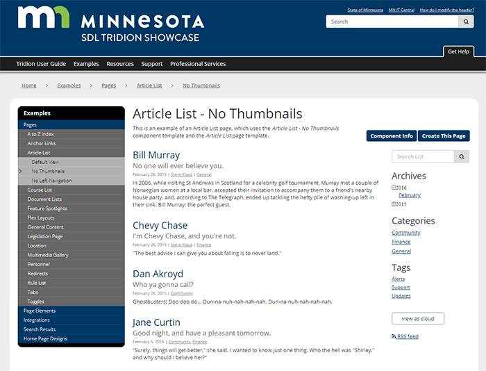
The Article List - No Thumbnails component template is nearly identical to the default Article List component template, except that it removes thumbnails from the main list page. An example is pictured below:
Since the features of this page are created in the exact same manner as described above under the Article List (default) component template, please refer to that section for a description of how to enable or disable features on an Article List page.
Article Spotlight List
The Article Spotlight List series of component templates are not intended to be used in an Article List page, but instead are page elements used within Flex Landing pages.
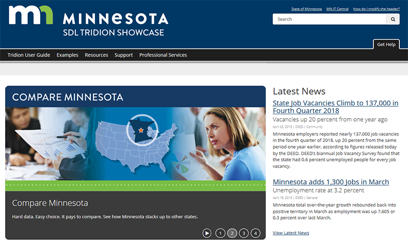
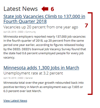
Below is a an example of the Article Spotlight List component template, as used in a two-column Flex Landing Page. The Article Spotlights are in the right column, under the heading "Latest News."
The example pictured above is just one possible layout. Many more possible layouts can be seen on these example pages for Article Spotlight Lists (default) on a Flex Layout Main Landing Page and a Flex Layout Internal Page.
The Article Spotlight List component template uses content from two fields in the Article List component:
- The Spotlight Headline (#6) field generates the headline that appears above the articles in the spotlight section. This field is optional.
- The Spotlight Number (#7) field determines how many articles should appear in the spotlight section on the page. You can select from between 1 - 5, 10, 15, 20, 25, 50, or 100. Since the spotlight section is meant to be compact, we generally recommend displaying 5 articles or less, but your business needs may vary. The articles will display in the order of most recent at the top to least recent at the bottom, no matter what you select in field #9 of the article list component. Field #9 only applies to the article list page associated with the article spotlights.
The other content displayed within the article spotlights is generated from the article components. Please refer to those instructions if you wish to change the headline of an article, the date of an article, an article thumbnail, or other article-related content.
Tip: If an Article Spotlight is included on a Flex Page, but not within a separate published Article List page, the Article Spotlights will display on the Flex Page but clicking on the articles will result in a broken link. Make sure you have an Article List page to accompany any article spotlights you create.
Article Spotlight List (with thumbnails)
The Article Spotlight List series of component templates are not intended to be used in an Article List page, but instead are page elements used within Flex Landing pages.
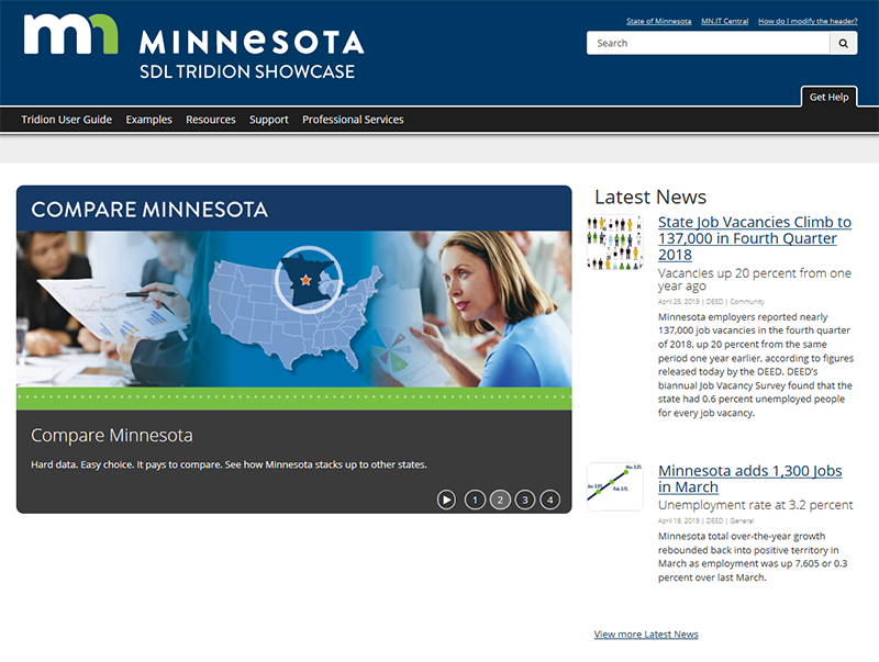
Below is an example of the Article Spotlight List (with thumbnails) component template, as used in a two-column Flex Landing Page. The Article Spotlights are in the right column, under the heading "Latest News."
The example pictured above is just one possible layout. Many more possible layouts can be seen on these example pages for Article Spotlight List (with thumbnails) on a Flex Layout Main Landing Page and a Flex Layout Internal Page.
As described in the Article Spotlight List component template section above, the Article Spotlight List (with thumbnails) component template uses just two fields from the Article List component template - the Spotlight Headline (#6) and the Spotlight Number (#7). All other article-related content, including the thumbnails, is entered within, and generated form, the associated article components.
Article Spotlight List Row (feature image and list)
The Article Spotlight List series of component templates are not intended to be used in an Article List page, but instead are page elements used within Flex Landing pages.
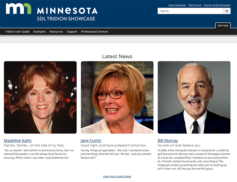
Below is an example of the Article Spotlight List Row (feature image + list) component template, as used in a Flex Landing Page. This component template takes up an entire row. It displays the most recent article on the left, with that article's image prominently displayed above it. On the right, additional recent articles are displayed alongside the article image.
The example pictured above is just one possible layout. Many more possible layouts can be seen on these example pages for Article Spotlight List Row (feature image and list) on a Flex Layout Main Landing Page and a Flex Layout Internal Page.
As described in the Article Spotlight List component template section above, the Article Spotlight List Row (feature image + list) component template uses just two fields from the Article List component template - the Spotlight Headline (#6) and the Spotlight Number (#7). All other article-related content, including the large article image, is entered within, and generated form, the associated article components.
Article Spotlight List Row (with thumbnails)
The Article Spotlight List series of component templates are not intended to be used in an Article List page, but instead are page elements used within Flex Landing pages.
Below is an example of the Article Spotlight List Row (with thumbnails) component template, as used in a Flex Landing Page. This component template takes up an entire row. It displays the most recent article on the left, and the least recent on the right. Thumbnails from the articles are shown above each article.
The example pictured above is just one possible layout. Many more possible layouts can be seen on these example pages for Article Spotlight List Row (with thumbnails) on a Flex Layout Main Landing Page and a Flex Layout Internal Page.
As described in the Article Spotlight List component template section above, the Article Spotlight List Row (with thumbnails) component template uses just two fields from the Article List component template - the Spotlight Headline (#6) and the Spotlight Number (#7). All other article-related content, including the large article image, is entered within, and generated form, the associated article components.
Article Spotlight List - Row 1 (default)
This is an antiquated way of displaying spotlights that we are working on phasing out. It only works with the page template Home Landing Page (antiquated).
Please use one of the other Article Spotlight component templates described above.
Article Spotlight List - Row 2 (default)
This is an antiquated way of displaying spotlights that we are working on phasing out. It only works with the page template Home Landing Page (antiquated).
Please use one of the other Article Spotlight component templates described above.
Article Spotlight List - Row 3 (default)
This is an antiquated way of displaying spotlights that we are working on phasing out. It only works with the page template Home Landing Page (antiquated).
Please use one of the other Article Spotlight component templates described above.