This optional header box, called a Toggle Box, can be used for highlighting whatever content you would like. This is a rich-text field, so you can add links, images, bullets, etc.
Below are the steps for creating a Datagrid page. Datagrids are extremely complex to make and if this is the first time you've made one, you're likely to need some assistance. Try making one on your own using the instructions below. If you run into problems, please open a support ticket.
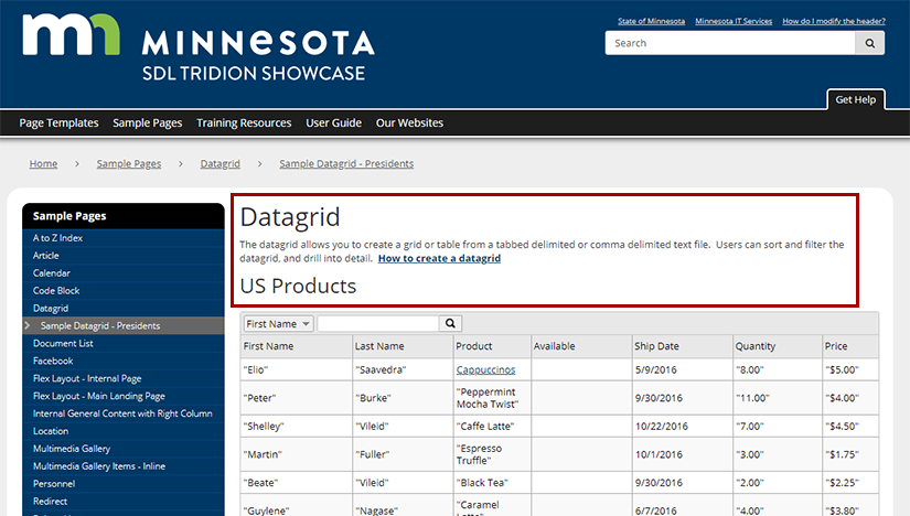
The first thing to build for a Datagrid page is a General Content component with the headline and introductory text, highlighted in red below. Below are the steps for creating this component:
In the 020 section, navigate to the folder where you want the components for the Datagrid page to reside.
Create a new component and complete the following fields:
Title: enter the headline for the Datagrid page here.
Content: enter the introductory text that will go at the top of the page. This is a rich-text field, so you can add other elements like images, links, etc.
Datagrids are built using a separate file, called a source file, that contains your raw data. This step will walk you through the process of creating, preparing, and uploading your source file into Tridion.
Instructions for preparing your source file
The source file can be formatted as tab delimited (.txt), comma separated values (.csv), JSON, or XML.
Since the majority of people will be using .txt or .csv files, these instructions will focus just on those. If you want to build a datagrid using JSON or XML and need help doing so, please submit a support ticket and we will assist you.
CSV files
Tip: If your data contains commas, this will affect the way your data displays in the datagrid. The datagrid will read each comma in your data as an instruction to move the data to a new column. If your data contains commas, consider using a TXT formatted file as your source file.
The easiest way to create a CSV file is in Microsoft Excel. Here are the steps for doing so.
Generate a spreadsheet that contains the data you wish to display in your datagrid, with data separated into columns.
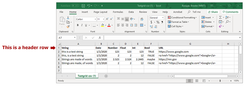
If your spreadsheet has a header row (example pictured below), you will need to delete the header row.
If your data contains line breaks within a single cell, you will need to insert HTML break tags where the line should be. For example, an address in a spreadsheet should be formatted like this:
The reason for this is because if you simply try to put the data on separate lines within a cell, the datagrid will interpret each line as data for a new cell. This will mess up your entire datagrid, because it will push data into the wrong cells. Using HTML break tags ensures that all the data displays within the same cell, and your entire datagrid will display properly.
Using Excel's Save As feature, save your file in a comma-separated value (.csv) format.
Tip: Watch out for line breaks in your spreadsheet cells. Datagrids will read these as a command to move the next bit of data into a brand new cell. Use HTML break tags, as described in bullet #3 above, for breaks in the middle of data, and make sure you erase any line breaks that might be at the beginning or end of data within a cell.
TXT files
.txt files offer some advantages over .csv files, like being able to include commas in your data without problems. However, txt files are harder to edit and maintain. The most convenient way to create a .txt file is using Microsoft Notepad. Here are the steps for doing so:
Create a file in Microsoft Notepad. Type in the data, and hit the "Tab" button between each piece of data that should be in a new column. Hit Enter to start a new row of data.
(You can also create the file in Excel and save it as a tab-delimited file, but doing so will put quote marks around any data that contains commas. To remove those quotes, you will have to save the file as tab delimited in Excel, open the file in Notepad, and remove all the quote marks from your file.)
If your data has a header row, you will need to delete the header row.
Save the file as a .txt file.
Including URLs in your data
If you are comfortable with writing HTML links and want your data to be formatted as a descriptive link, then you can format your URLs like: <a href='http://www.google.com'>Google</a>. (Please note the single quotes, rather than double quotes, around the link. Using double quotes will cause the datagrid to display incorrectly.)
If you don't want to mess with HTML, you can also paste a URL directly into your data, like: http://www.google.com. If you use this format, you should not have any other data in the same column (for CSV files) or tabbed space (for TXT files). You will also need to set the cell type to URL in the datagrid configuration file.
Uploading the file
Regardless of which source file type you selected, the process for uploading your file is the same. Please do the following:
In the 020 section, navigate to the folder where the components for the Datagrid page will reside.
Create a new multimedia component and complete the following fields:
As you can see on the Datagrid example page, there are two types of datagrid views: Table or Grid.
In short, the Grid view offers more features. The most significant is that it offers a Detail View, where you can add more information to the grid. The Grid view also allows users to rearrange columns on the page, and includes filters at the top of each column.
The Table view offers many of the same features as the datagrid, but does lack the ones noted above.
You can see a more detailed breakdown of the differences between the Grid and Table views on the Datagrid Configuration Component page, in the Component Templates section.
Decide which option is best for your page, and follow the instructions below for creating a datagrid configuration file.
Follow the instructions below for the datagrid view that you decided upon in step 3. If you plan to use a table view, you do not need to complete any instructions that are labeled "(grid view only)."
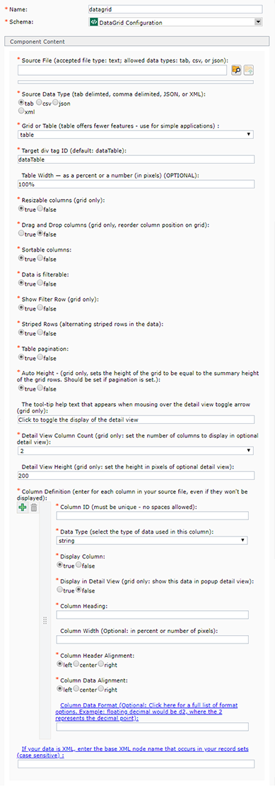
Source File: select your source file by clicking the browse folder icon at the end of the Source File field. Then, navigate to the file that you uploaded in step 2 and double-click on it.
Source Data Type: select one of the following options: tab, csv, json, or xml. This must match the data type used when creating the Source File.
Grid or Table: select grid or table from the drop-down menu.
Target div tag ID: if you are going to have just one datagrid on your page, you can leave the default entry for this field ("dataTable"). If you intend to have multiple datagrids on your page, this field needs to have a unique ID for each grid. You can put whatever you want in the field, like "presidents" or "erasers," just as long as it doesn't match what was entered for a different grid.
Table Width: enter the width, in percentage, that the datagrid should take up on your page. We strongly recommend using the 100% default, as the narrower you go, the more your columns will get squished.
Resizable columns (grid view only): select True or False. If set to True, this allows web users to narrow or widen the columns on the datagrid by clicking and dragging the column edges. If set to False, users will not be able to change the column widths.
Drag and Drop columns (grid view only): select True or False. If set to True, web users will be able to click a column on the page and drag/drop it into a different place. This allows users some control over how they view and sort data. If this field is set to False, the columns will remain locked in place and users will not be able to move them.
Sortable columns: select True or False. If True, web users can sort the columns in either ascending order (A to Z, 1 to 99, etc.) or descending order (Z to A, 99 to 1, etc.). If set to False, users will not be able to sort columns.
Data is filterable: select True or False. If True, web users will be able to filter the data in individual columns by searching in the filter box(es) at the top of the columns. If set to false, users will not be able to filter data.
Show Filter Row (grid view only): select True or False. If set to True, a row for filtering data (which looks like a bunch of search boxes) will appear above the first row of data in the grid. If set to False, this row for filtering data will not appear on the grid.
Striped Rows: select True or False. If set to True, the background color of the rows in the datagrid will alternate between white and a subtle gray. If set to false, all datagrid rows will be white.
Table pagination: select True or False. If set to True, users will be given the ability to move back and forth between pages in the datagrid. If set to false, the page navigation will be removed and all of the data rows will be visible in a single datagrid.
Auto Height (grid view only): select True or False. If True, the height of the grid will be equal to the total height of all the grid rows. We recommend this if you have pagination (#12) set to True. If set to False, the grid will not equal the total height.
The tool-tip help text that appears when mousing over the detail view toggle arrow (grid view only): enter the text that should appear when a user hovers over the expand/collapse arrow next to a row of information. If you are using a Table view, you can skip this field.
Detail View Column Count (grid view only): set the number of columns that appear in each row of the detail view window (the detail view is what appears when a user clicks the expand arrow next to a row of information). If you are using the Table view, you can skip this field.
Detail View Height (grid view only, optional): set the height in pixels for the detail view area.
Column definition: for each column in your source file (item #1), you will need to complete the set of fields below. The Datagrid Configuration component displays one set of Column Definition fields by default, which you can use for the first column in your source file. Click the green plus sign to create additional sets of Column definition fields for the remaining columns in your source file.
Column ID: create a unique ID for your column. The unique ID must be all one word without spaces. What you enter in this field cannot match any other Column IDs created in this datagrid configuration component.
Data Type: select the type of data used for this column in your source file. Your options are:
String: **Pick this if you are unsure which data type to select.** Strings can be data in any combination of letters and numbers, like a phrase or sentence. This is the data type to pick if your column contains descriptive links.
Date: use this if the data in the column contains only dates. The default display for dates is the following format: "Wed Jan 01, 2020 00:00:00 GMT-0600 (Central Standard Time)," regardless of how the date was entered in the original file. This format can be changed through the Column Data Format field below.
Number: use this if the data in the column contains only numbers. The data can contain a mix of integers and floating numbers.
Float: This refers to numbers with decimals in them, like 1.5 or 4.23434, which are called floating numbers. The data for this field can contain a mix of integers and floating numbers.
Int: This refers to integers, which are whole numbers (1, 10, 200, etc.). Select this if the data in your column contains only integers. Any floating numbers in the data will be converted to integers automatically by the system, through the removal of the decimal point and any numbers behind it (a number like 2.7345 will be converted into a 2, the system simply removes the decimal numbers and does not round up).
Bool: This refers to Boolean data, which is True or False (or can equate to True or False). Use this only if all the data in your column meets this criteria.
URL: Use this if the data in your column only contains URLs to websites or webpages, for example: https://www.google.com. Anything entered in the field will be turned into a link, regardless of whether it is actually a link or not. Descriptive links (which are links that are more than just URLs) must be entered as String data types rather than URL data types.
Display column: select True or False. If True, the data in this column will be displayed on your datagrid. If False, the data will not be displayed in the default view of the datagrid. This allows you to either a) hide columns of data from the grid view, but still display them in the detail view or b) hide columns of data from the grid entirely, without having to remove those columns of data from the original csv, tab, json, or xml file.
Display in Detail View (grid view only): select True or False. If set to True, the data in this column will only show in the expandable Detail view (note: if you selected True for the Display column field, it will show in both the default datagrid view and the detail view). If set to False, the data in this column will display as a column UNLESS you have also selected False in the "Display column" field - in which case the data will not display at all in the datagrid.
Column Heading: enter the word or phrase that should appear as the column header (or field name, if this column is displayed in the Detail View) in the datagrid.
Column Width: (optional) set the width for your column in the datagrid. It can be set using percentages or pixels. If you don't enter anything in this column, the datagrid will automatically size your content to fit on all devices. Please test your settings on mobile devices as well as desktops, to ensure that your grid is readable on all devices.
Column Header Alignment: select left, center, or right to align the column header text.
Column Data Alignment: select left, center, or right to align the column data text.
Column Data Format: (optional) The majority of users will not enter anything in this field. If you selected Date, Number, Float, or Int in the Data Type field, you can further adjust how you want that data to display in the datagrid. Please click on the title of this field ("Column Data Format") and, in the window that appears, follow the instructions for formatting your data as you wish.
If your data is XML, enter the base XML node name that occurs in your record sets: (optional) you only need to complete this field if your Source Data Type (#2) is XML. Click the title of this field to open a pop-up window that can help you identify your XML node name.
For the Page Template field, uncheck "Inherit from Parent." Then, in the drop-down menu for the field, select Datagrid - Standard Display.
Click the Design tab.
Click the Add button:
Navigate to the General Content component you created in step 1, select it, apply the Page Introduction component template, and insert it into the page.
Navigate to the Datagrid Configuration component you created in step 4, apply the Datagrid component template, and insert it into the page.
Close the Insert Component Presentation pop-up window.
When you've completed all the steps above, then all you need to do next is publish your Datagrid page.
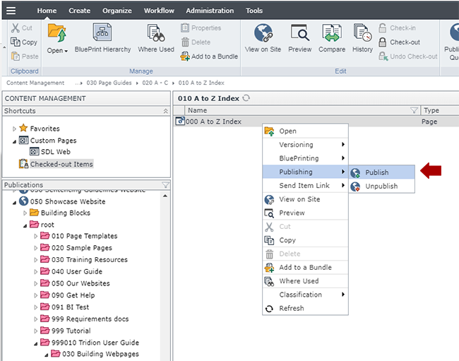
Navigate to the Datagrid page you built in step 5, right-click on it and select Publishing > Publish.
Select the site you wish to publish to and click Publish. This will send the Datagrid page to the publishing queue.
We also recommend republishing the navigation at this point, so it picks up the new page.
Technical Specifications
Below are the types of components that can be used in the Datagrid page template, along with the component templates and number of components for each type that can be inserted in the page.
Component Types
Accepted Component Templates
Min/Max
General Content
General Content
Feature Jumbotron
Internal Jumbotron
Page Introduction
Page Introduction - Jumbo Feature Image (black text bar)
Page Introduction - Jumbo Feature Image (white text bar)