This optional header box, called a Toggle Box, can be used for highlighting whatever content you would like. This is a rich-text field, so you can add links, images, bullets, etc.
(Optional) Create a headline and introduction for the page
If you're creating a Flex Layout - Main Landing Page, then you may want to skip this step. Typically those pages do not have headlines and introductions on them, but it depends on your needs.
If you're creating a Flex Layout - Internal Page, we recommend creating a headline and introduction for the page. Below are the steps for doing so:
In the 020 section, navigate to the folder where the components for the Anchor Links page will reside.
Create a new component and complete the following fields:
Content: enter the introductory text that will go at the top of your page. This is a rich-text field, so you can add other elements like images, links, etc.
Flex Layout pages are very flexible in how they are built, so which components you need to build will vary based on what you want the final page to look like.
No matter what you build, you'll need to build Flex Row Configuration components, as those are the foundation for all Flex Layout pages.
Other component types that you may wish to include, along with possible component templates, are shown in the table below.
For the Page Template field, uncheck "Inherit from Parent." Then, in the drop-down menu for the field, select one of the following:
Flex Layout - Main Landing Page: this will create a page without a left navigation
Flex Layout - Internal Page: this will create a page with a left navigation
Click the Design tab.
Click the Add button:
If you created a headline and introduction component in in step 1, navigate to and select it, apply the Page Introduction component template, and insert it into the page.
Navigate to the components you created in step 2, select them, apply the appropriate component template to all, and insert them into the page.
Close the Insert Component Presentation pop-up window.
Re-order your components as needed so that your Flex Row Configuration components come before the components used within the Flex Row. See the page on Flex Row Configuration components if you need more information on how to organize the components.
When you've completed all the steps above, then all you need to do next is publish your page.
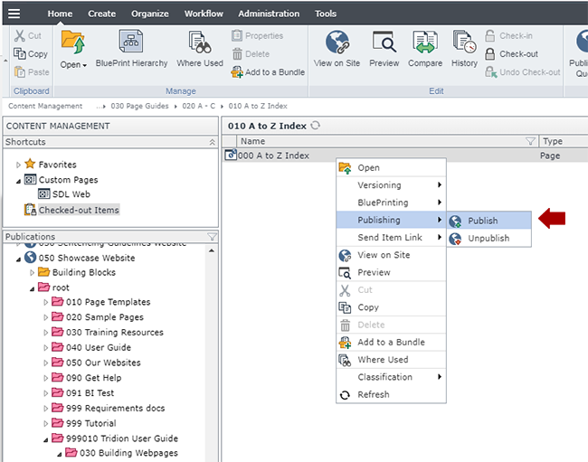
Navigate to the page you built in step 3, right-click on it and select Publishing > Publish.
Select the site you wish to publish to and click Publish. This will send the page to the publishing queue.
We also recommend republishing the navigation at this point, so it picks up the new page.
Technical Specifications
Below are the types of components that can be used in the Flex Layout page templates, along with the component templates and number of components for each type that can be inserted in the page.
Component Type
Accepted Component Templates
Min/Max
Article Spotlight List
Article Spotlight List (with thumbnails)
Article Spotlight List Row (with thumbnails)
Article Spotlight List Row (feature image and list)
0 - 100
Caspio App
Caspio App
0 - 100
Code Block
Code Block
0 - 100
Datagrid
Datagrid
0 - 100
Facebook
Facebook
0 - 100
Flex Row Configuration
0-100
General Content
Feature Jumbotron
Internal Jumbotron
Page Introduction
Page Introduction - Jumbo Feature Image (black text bar)
Page Introduction - Jumbo Feature Image (white text bar)