This optional header box, called a Toggle Box, can be used for highlighting whatever content you would like. This is a rich-text field, so you can add links, images, bullets, etc.
Article List pages are dynamic pages, which means they operate differently than the majority of Tridion pages. Instead of inserting every article into a page and then publishing it, you build and publish the page once, and then create and publish articles separately. Articles are associated with the page through Article List keywords. Below is a flowchart depicting the process:
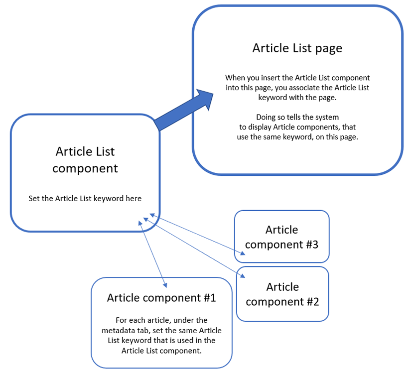
To begin, we recommend creating an Article List component first. In that component, you'll create and select a specific Article List keyword.
Next, you'll create an Article List page, and insert the Article List component into the page. This associates the Article List page with the keyword you selected in the Article List component.
Then, you'll create the articles that will appear on the page. You'll need to create each article individually using separate Article components. In each article component, under the metadata tab, you'll select the same Article List keyword that you selected in the Article List component. This is how the article is linked to the page, and how the system knows which page to display the articles on, once they are published.
When ready, publish the page and article components you've created.
Tip: The setup described above shows how to associate articles with one specific page, but you can select multiple Article List keywords within the Article component. By doing so, you can reuse the same article component on multiple pages, as long as each Article List keyword has its own Article List page that has been created and published.
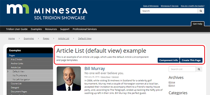
The first thing to build for an Article List page is a General Content component with the headline and introductory text, highlighted in red below. Below are the steps for creating this component:
In the 020 section, navigate to the folder where you want the components for the Article List page to reside.
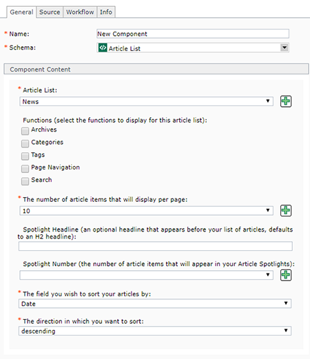
Create a new component and complete the following fields:
Title: enter the headline for your Article List page here.
Content: enter the introductory text that will go at the top of your page. This is a rich-text field, so you can add other elements like images, links, etc.
Article List: This is the field where the Article List keyword for this component is set. If your Article List keyword has already been created, then you can select it from the drop-down menu. If you need to create a new Article List keyword, you can click the green plus icon . This will open a pop-up window where you can create a new Keyword for your Article List. After saving and closing the new keyword, it will appear in the drop-down list for this field and you will be able to select it. You can only select one keyword per Article List component.
Functions: check the box for each item that you want to display on the page:
Archives: if selected, on the right side of the page, an Archive column will appear. This column automatically compiles published articles, categorized by year and then by month. When a user clicks on a specific month, they will see only the articles published during that month.
Categories: if selected, on the right side of the page, a Categories column will appear. In thus column, all categories that have been used in published articles will appear in a list format. Users can click the name of a category to see only published articles that have been assigned to that category.
Tags: if selected, on the right side of the page, a Tags column will appear. Similar to the Category column, all tags that have been used in published articles will appear in a list format (users can also click a button to view these in a word cloud). Users can click on a tag to see only published articles that have been assigned that tag.
Page Navigation: this generates the page navigation that appears at the bottom of a list of articles. Generally, we recommend enabling this feature. The only exception would be if you have a short list of articles that would never require multiple pages.
Search: if selected, a search box will appear at the top of the right column on the page. This allows users to search within the article list. This feature only searches the article list, and not the entire website.
The number of article items that will display per page: select the number of articles to appear on the page. The options are 1, 2, 3, 4, 5, 10, 15, 20, 25, 50, and 100.
Spotlight Headline: if this article list will be used as a spotlight on a flex row page, then an optional headline can be entered here. The headline displays above the spotlights.
Spotlight Number: for article lists that will be used as spotlights on a flex row page, you can select the number of articles to display. The options are 1, 2, 3, 4, 5, 10, 15, 20, 25, 50, and 100. Generally, we recommend 5 or less.
The field you wish to sort your articles by: the options are Title, Subtitle, Date, Category, and Tag. The most commonly used are Title and Date. When the page loads, it will sort the articles based on the field you have selected, plus the criteria set in the next step (#8).
The direction in which you want to sort: the options are Ascending and Descending. Ascending sorts, for example, from A - Z or 1 - 10. Descending sorts, for example, from Z - A or 10 - 1.
If you have further questions about how these fields render on the page, please refer to the Article List component page, which includes examples of the component templates.
For the Page Template field, uncheck "Inherit from Parent." Then, in the drop-down menu for the field, select either:
Article List - selecting this will result in the default Article List page, which includes a left navigation menu. We recommend selecting this one if you are unsure which page template to pick.
Navigate to the General Content component you created in step 1, select it, apply the Page Introduction component template, and insert it into the page.
Navigate to the Article List component you created in step 2, select it and apply one of the following component templates, and insert it into the page:
Article List - selecting this will result in the default Article List page, which includes thumbnails alongside each article.
In the folder that you created in step 5, now you will create Article components to populate your Article List page. Create one or more Article components using the following instructions:
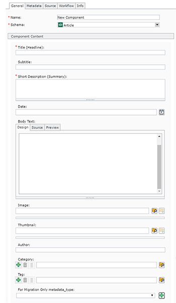
Name: enter a name for your component. For articles, we recommend naming your content in the following format: YYYY-MM-DD Title of Article. This will make it easier for you to locate, edit, and publish your article content.
Schema: select Article
Title (Headline): enter the title, or headline, of your article here.
Subtitle: this field is optional, enter a subtitle here as needed.
Short Description (Summary): enter a short 1-3 sentence summary, or teaser, of the article here. This is meant to entice users to click through to read the full article.
Date: enter a date in this field by clicking the little calendar icon to the right of the field (you cannot manually type a date in this field). A pop-up will appear, which allows you to navigate through a calendar and select a date (you can forward or backdate articles as needed). The Time field is in 24 hour time, so for a time like 2:00 pm, you will need to enter 14:00:00.
Body text: this is where the full text of your article goes. This is a rich-text field that accepts images, tables, links, and other formatting.
Image: this field is optional. Enter an image here, preferably one that is 625 pixels wide (or wider) and formatted for the web. (If it is smaller or larger, Tridion will auto-resize it for display.)
Thumbnail: this field is optional. Enter a thumbnail version of the image here, preferably one that is square and 140 pixels x 140 pixels and formatted for the web. (If it is smaller or larger, Tridion will auto-resize it for display.)
Author: this field is optional. Enter the article's author here. For previous and future articles, the system will link matching names - so if you have an author who has written numerous articles, make sure you spell their name exactly the same in each article component so the system can link them together.
Category: this field is optional. Categories should be thought of as larger "buckets" for organizing articles. For example, if you work for DEED, you may use categories like "For Job Seekers" or "For Business" or "For Government." You can assign more than one category to an article by clicking the green plus icon . You can select, or create new, categories by clicking the browse folder icon . Users will be able to filter by these categories.
Tag: this field is optional. Tags should be thought of as more detailed ways of organizing articles. Using the example from the category field above, say you had assigned the category "For Job Seekers" to an article. Now you should want to tag it with more details related to that category. For example, some tags you might use could include "resumes," "job hunting," "interviews," "careers," etc. You can assign more than one tag to an article by clicking the green plus icon . You can select, or create new, tags by clicking the browse folder icon . Users will be able to filter by these tags.
For Migration Only metadata-type: you do not need to complete this field, please leave it blank.
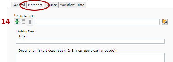
Article List: to locate this field, click the Metadata tab at the top of the component. In this field, you will pick the same Article List keyword that you used above in Step 2, field 3. This is how you associate the article component you are creating with the Article List page that the article should appear on.
Dublin Core metadata fields: underneath the Article List field are a number of Dublin Core metadata fields. You do not need to complete these fields - they are not used anywhere on the website.
For more information about how the fields in an article component render on Article List pages, please refer to the Article component information page.
When you've completed all the steps above, then all you need to do next is publish your Articles.
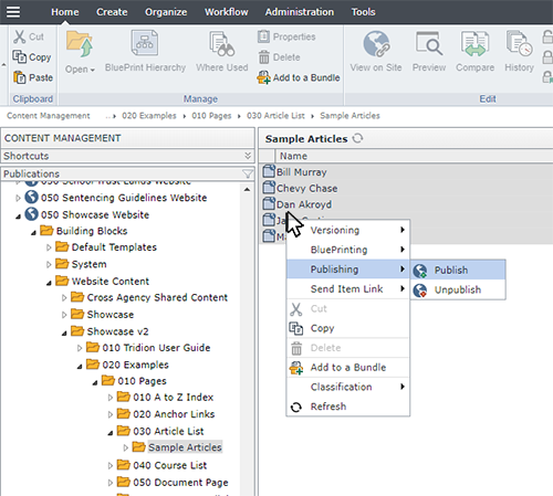
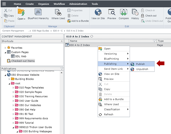
In the 050 section, navigate to the Article components you built in step 6, right-click on one (or more) and select Publishing > Publish.
Select the site you wish to publish to and click Publish. This will send the Articles to the publishing queue.
Once your articles have published, they will appear on the Article List page you created and published in steps 3 and 4.
Technical Specifications
Below are the types of components that can be used in the Article List page template (with or without left navigation), along with the component templates and number of components for each type that can be inserted in the page.
Component Type
Accepted Component Templates
Min/Max
General Content
Feature Jumbotron
Internal Jumbotron
Page Introduction
Page Introduction - Jumbo Feature Image (black text bar)
Page Introduction - Jumbo Feature Image (white text bar)