Create an Internal Landing Page with Feature Spotlights
This page contains information on how to create an Internal Landing Page with Feature Spotlights.
Looking for help? Submit a Support Ticket and we will assist.
This optional header box, called a Toggle Box, can be used for highlighting whatever content you would like. This is a rich-text field, so you can add links, images, bullets, etc.
You can edit it through the Header component on your website.
This page contains information on how to create an Internal Landing Page with Feature Spotlights.
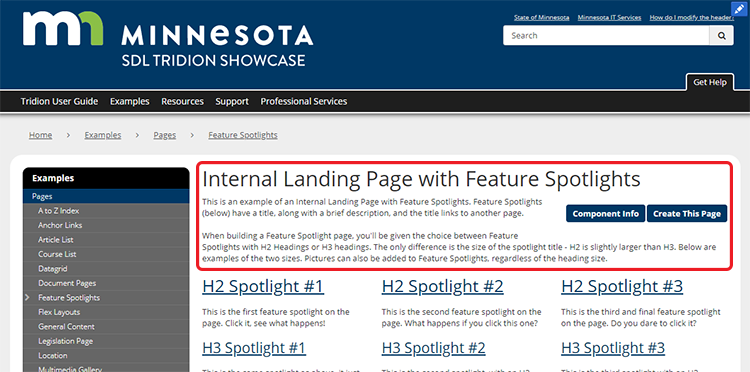
The first thing to build is a General Content component with the headline and introductory text, highlighted in red below, that you need to appear on the page. Below are the steps for creating this component:
Feature Spotlights are made with General Content components by completing the following fields:
Save and Close your General Content component when complete.
Repeat this step as needed for each Feature Spotlight that will appear on your page.
In step 2 above, the components you created will be used to generate both the feature spotlights AND the pages they link to. Below are the instructions for creating the latter - the pages that the Feature Spotlights will link to.
Repeat the above steps as many times as you need, to create all the pages that the Feature Spotlights will link to.
When you've completed all the steps above, then all you need to do next is publish your Feature Spotlights page.
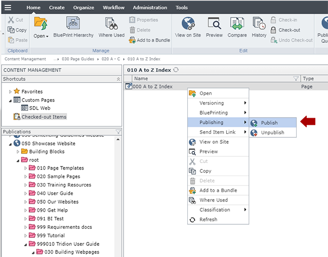
Navigate to the Feature Spotlights page you built in step 3, right-click on it and select Publishing > Publish.
Select the site you wish to publish to and click Publish. This will send the page to the publishing queue.
We also recommend republishing the navigation at this point, so it picks up the new page.
Below are the types of components that can be used in the Internal Landing Page with Feature Spotlights page template, along with the component templates and number of components for each type that can be inserted in the page.
Component Type | Accepted Component Templates | Min/Max |
---|---|---|
General Content |
|
0-21 (feature spotlights) 0-1 (all other templates) |
Caspio App |
|
|
Code Block |
|
1-1000 |
Multimedia Gallery Item |
|