This optional header box, called a Toggle Box, can be used for highlighting whatever content you would like. This is a rich-text field, so you can add links, images, bullets, etc.
Document List pages are dynamic pages, which means they operate differently than the majority of Tridion pages. Instead of inserting every document into a page and then publishing it, you build and publish the page once, and then create and publish documents separately. Documents are associated with the page through Document List keywords. Below is a flowchart depicting the process:
To begin, we recommend creating a Document List component first. In that component, you'll create and select a specific Document List keyword.
Next, you'll create a Document List page, and insert the Document List component into the page. This associates the Document List page with the keyword you selected in the Document List component.
Then, you'll create the documents that you want to appear on the page. You will need to create each document individually using separate Document components. In each document component, under the metadata tab, you'll select the same Document List keyword that you selected in the Document List component. This is how the document is linked to the page, and how the system knows which page to display the documents on, once they are published.
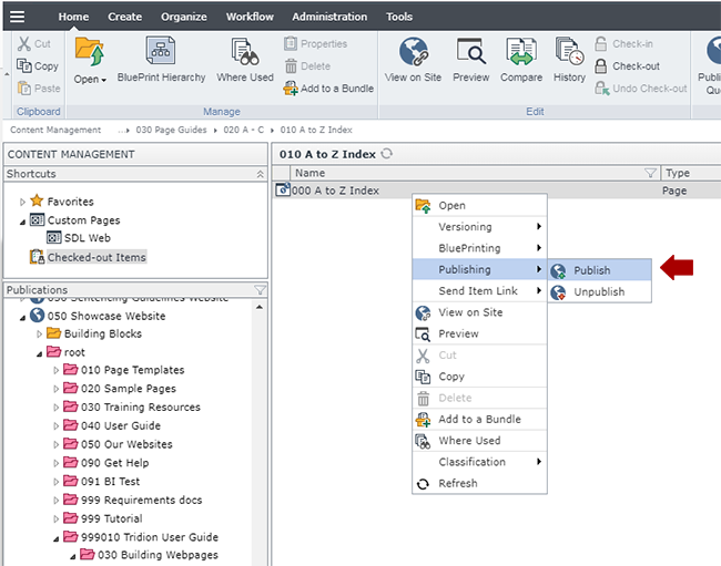
When ready, publish the page and document components you've created.
The setup described on this page shows how to associate documents with one specific page, but you can select multiple Document List keywords within the Document component. By doing so, you can reuse the same document component on multiple pages, as long as each Document List keyword has its own Document List page that has been created and published.
The first thing to build for a Document List page is a General Content component with the headline and introductory text, highlighted in red below. Below are the steps for creating this component:
In the 020 section, navigate to the folder where you want the components for the Document List page to reside.
Create a new component and complete the following fields:
Title: enter the headline for your Document List page here.
Content: enter the introductory text that will go at the top of your page. This is a rich-text field, so you can add other elements like images, links, etc.
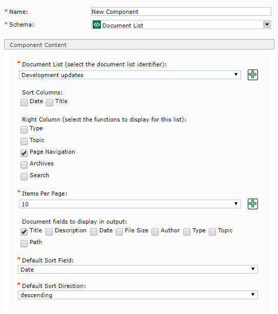
Document List: select the Document List keyword. You can only select one keyword, because this is the keyword that you will use to associate individual documents with the page that this Document List component is inserted into.
If your Document List keyword has already been created, then you can select it from the drop-down menu. If you need to create a new Document List keyword, click the green plus icon . This will open a pop-up window where you can create a new keyword. After saving and closing the new keyword, it will appear in the drop-down list for this field and you will be able to select it.
Sort Columns: this field is optional. Select Date,Title, or both. When you select either option, it will add a sorting feature to the right column of the page.
Right Column: check the box for each item that you want to display on your Document List page.
Type: if selected, a Type column will appear on the right side of the Document List page. In this column, all Types that have been used in published documents will appear in a list. Users can click the name of a Type to see just the documents that have been assigned to that Type.
Topic: if selected, a Topic column will appear on the right side of the Document List page. In this column, all Topics that have been used in published documents will appear in a list. Users can click the name of a Topic to see just the documents that have been assigned to that Topic.
Page Navigation: this generates the page navigation that appears at the bottom of a list of documents. Generally, we recommend enabling this feature.
Archives: if selected, an Archive column will appear on the right side of the Document List page. This column compiles published documents and categorizes them by year and then by month. When a user clicks on a specific month in this column, they will see only the documents published during that month.
Search: if selected, a search box will appear at the top of the right column of the Document List page. This allows users to search within the document list.
Items per page: select the number of documents to appear on the page. The options are 1, 2, 3, 4, 5, 10, 15, 20, 25, 50, and 100.
Document fields to display in output: check the box for each item that you want to display on your Document List page.
Title: this field should always be selected.
Description: if selected, the document's short description will appear on your page. We highly recommend selecting this.
Type: if selected, the document Type(s) will appear on the page. This feature only works on the Document List (datagrid) pages.
Topic: if selected, the document Topic(s) will appear on the page. This feature only works on the Document List (datagrid) pages.
Path: if selected, the path will appear underneath each document. This feature only works on the Document List (no thumbnails) page.
Default sort field: your options are Title, Description, Date, Size, and Author. The option you choose will affect the sort order of the documents on the page. For example, if you select Title, then the documents will sort by the contents of the Title field.
Default sort direction: your options are ascending and descending. The option you choose will affect the sort order of the documents on the page, along with what you selected for the Default Sort Field (#8). For example, if you opt to select ascending for this field and also selected Title for the default sort field (#8), then the default sort order for your documents will be A to Z by title.
For more information about how these fields render on the final page, please refer to the Document List component page, which includes examples of component templates.
In the 050 section, navigate to (or create) the structure group where the Document List page will reside.
Create a new page.
Fill in the Name, File Name, Page Display Name, Dublin Core Title, and Dublin Core Description fields.
For the Page Template field, uncheck "Inherit from Parent." Then, in the drop-down menu for the field, select Document Page.
Click the Design tab.
Click the Add button:
Navigate to the General Content component you created in step 1, select it, apply the Page Introduction component template, and insert it into the page.
Navigate to the Document List component you created in step 2, select it and apply one of the following component templates, and insert it into the page:
Document List - selecting this will result in the default Document List page, which includes thumbnails alongside each document.
Document List - Datagrid- selecting this will result in the Document List displayed as a datagrid.
In the folder that you created in step 5, now you will create Document components to populate your Document List page. Create one or more Document components using the following instructions:
Name: enter a name for your component. You may wish to establish a naming convention for your document components, so that it is easier to organize and find individual documents.
Schema: select Document
Title: enter the title of your document here.
Link to Document: choose from one of the two options:
Internal link to components (has priority over external links): use this if you are going to link to document within your website. You can select files such as PDFs, Word docs, Excel docs, PowerPoints, images, etc. or you can select a component included in a published page. Click on the Browse Folder icon , located at the end of the field. In the pop-up that appears, navigate to the document you wish to link to and double-click it. This will insert a link to the document.
External link to a web page or file: use this if you are going to link to a document or page on another website. Enter the full URL for the document, such as https://www.google.com
Short Description: enter a short 2 - 3 sentence summary of the document.
Thumbnail image: this field is optional. To display a thumbnail image for your document, click on the Browse Folder icon located at the end of the field. In the pop-up that appears, navigate to the thumbnail you wish to use and double-click it.
Date: this field is optional. Enter a date by clicking the little calendar icon to the right of the field. A pop-up will appear, which allows you to navigate through a calendar and select a date. The Time field is in 24 hour time, so to enter a time like 2:00 pm, you will need to enter 14:00:00. The date you select for this field will impact the sort order for documents on a Document List page, but the date does not affect when the document is published.
File size in KB: this field is optional. Enter the document's file size in KB, such as 1024
Author: this field is optional. From the drop-down, select an author for your document. If you need to add the author, click the green plus sign at the end of the row. In the new tab that opens, enter the author's name in the Value field and then Save and Close the tab. The author's name will now appear in the Author drop-down and you can select it.
Type: this field is optional. The Type field is used to identify the document type, which can be a broader type such as fact sheets, guidebooks, brochures. Or it can be a narrower type such as PDF, Word docs, PowerPoints, etc. You can select, or create new, tags by clicking the browse folder icon . You can assign more than one Type to a document by clicking the green plus icon .
Topic: this field is optional. The Topic field is used to categorize the content of the document, such as Arts, Education, Employment, Environment, Health, etc. You can create your own topic categories as needed. You can select, or create new, topics by clicking the browse folder icon . You can assign more than one Topic to a document by clicking the green plus icon .
For more information about how the fields in a document component render on Document List pages, please refer to the Document component information page.