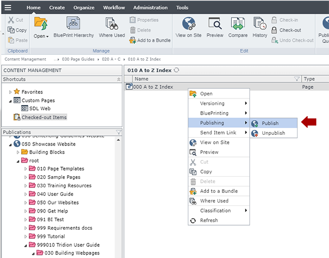
Create the Multimedia Gallery Item components
Below are the fields to complete, along with tips for completing them.
Tip: Tridion has file size limits that prevent uploading most audio and all video files. For video files, please upload them to YouTube and then link to the video(s) using the External Source File field below. For audio files, you may need a static account for hosting the files. Please connect with us to discuss storage options we offer.
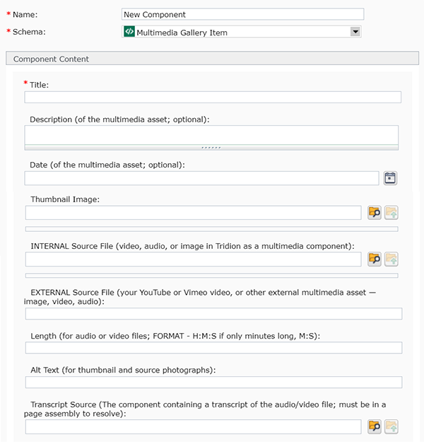
- Name: enter a name for your component.
- Schema: select Multimedia Gallery Item
- Title: enter the name of your multimedia item.
- Description: (optional) enter a brief description for your multimedia item.
- Date: (optional) enter a date in this field by clicking the little calendar icon
 to the right of the field. A pop-up will appear, which allows you to navigate through a calendar and select a date (forward and back dating articles is allowed). The Time field is in 24 hour time, so for a time like 2:00 pm, you will need to enter 14:00:00.
- Thumbnail Image: (optional) to enter a photo for your multimedia item, click the browse folder icon
 , navigate to the image you want to use, and select it.
- Internal Source File: (optional) to link to a file within your website, click the browse folder icon
 , navigate to the file you want to use, and select it.
- External Source File: (optional) to link to a file located outside your website, enter the URL here.
- Length: (optional, for audio and video files) enter the length of your file in H:M:S format.
- Alt Text: (optional, for images) enter a description of your image here, for screen readers.
- Transcript Source: (optional, for audio and video files) link to a transcript for your file by clicking the browse folder icon
 , navigating to the transcript component that is in a published page, and selecting it. (If you have not already created a transcript, here's where you can find information on creating a transcript.)
Save and Close the component.
Repeat these steps for each multimedia item you want to display in your Multimedia Gallery.


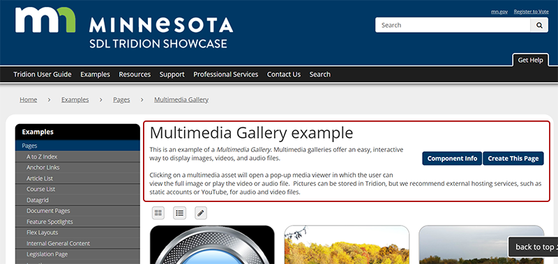 The first thing to build for a Location page is a General Content component with the headline and introductory text for the page, highlighted in red in the example pictured. Below are the steps for creating this component:

 to the right of the field. A pop-up will appear, which allows you to navigate through a calendar and select a date (forward and back dating articles is allowed). The Time field is in 24 hour time, so for a time like 2:00 pm, you will need to enter 14:00:00.
 , navigate to the image you want to use, and select it.