This optional header box, called a Toggle Box, can be used for highlighting whatever content you would like. This is a rich-text field, so you can add links, images, bullets, etc.
The first step to creating working Article Spotlights is to create an Article List page and at least one published article. If you have not already created these and need help doing so, please refer to these instructions for creating an Article List page.
Next you'll need to pick the layout you want for your Article Spotlights. Article Spotlights can only be used on Flex Layout pages, on either the Main Landing Page or the Internal Landing Page.
Article Spotlights come with four component templates, and an example of each component template are available to view on the Article Spotlight example page. The four component templates are:
Article Spotlight List - this displays articles in a column, just text without any images
Article Spotlight List (with thumbnails) - this displays articles in a column with thumbnail images on the left
Article Spotlight List Row (feature image and list) - this component template fills up an entire flex row. The most recent article is displayed prominently on the left, with a large image, and the next most recent articles are displayed in a column on the right side of the image.
Article Spotlight List Row (with thumbnails) - this component template also fills up an entire flex row. The most recent articles are displayed from left to right, with thumbnails above each article. This template will not display more than 4 articles.
In addition to picking one of the component templates above, you will also need to select:
which page template you'll use (the Flex Layout Main Landing Page or the Flex Layout Internal Landing Page)
which Flex Row Configuration component layout you want to use (in the "Examples of all available layouts" section below, you can see what all your options look like)
how many articles you want to display inside the Article Spotlight
Examples of all available layouts
Flex Layout - Main Landing Pages (has no left navigation):
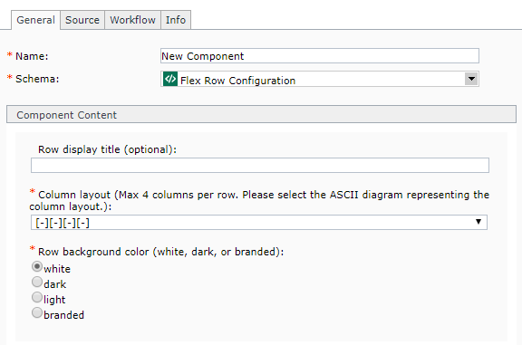
Row Display Title (optional): if desired, you can enter a headline for your row here. It will display at the top of the row, in the center.
Column Layout: select the column layout, based off the selection you made in step 2.
If you plan to use either the Article Spotlight List Row (feature image and list) orArticle Spotlight List Row (with thumbnails) component templates, then you should select the one column layout [----]. Both of those components take up an entire row, so no other columns are needed within the row.
Row background color: select the background color for your row. White is white, Dark is dark gray, Light is light gray, and Branded is the primary brand color set in your variables CSS file (the default color is the state's blue hue).
If you selected either the Article Spotlight List or the Article Spotlight List (with thumbnails) component template, along with a Flex Row Configuration of 2 or more columns, you will need to create additional components to fill in the other columns of the Flex Row.
Other components you could include (but aren't limited to) are: rotators, jumbo images, calendars, upcoming event highlights, blog highlights, etc.
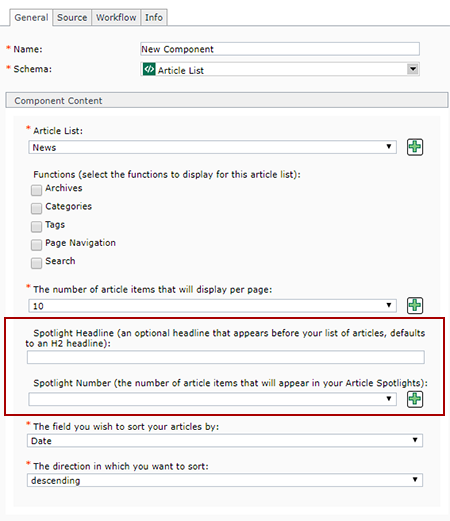
In the Article List component created for the Article List page (step 1), there are two fields that control how Article Spotlights display. Those two fields are circled below in red:
Configure your article spotlights by locating the Article List component you created in Step 1, open it, and then edit the following two fields:
Spotlight Headline (optional) - enter a headline that will appear above your article spotlights. If your article spotlights take up just one column, the headline will appear at the top of that column. If your article spotlights take up an entire row, the headline will appear centered at the top of the row.
Spotlight Number - enter the number of articles that should appear in your spotlight section. We generally recommend 5 or less, since article spotlights are intended to highlight only your most recent content, but your business needs may vary depending on your overall page layout.
Navigate to the Flex Row Configuration component you created in step 3, select it, apply the Flex Row Configuration component template, and insert it into the page.
Navigate to the Article List component you created in step 1, select it and apply one of the following component templates, and insert it into the page:
Article Spotlight List - this displays in a column without thumbnails
Article Spotlight List (with thumbnails) - this displays in a column with thumbnails
Article Spotlight List Row (feature image and list) - this displays in a row, with a the most recent article's image featured on the left
Article Spotlight List Row (with thumbnails) - this displays in a row with thumbnails above each article
Navigate to any additional components you created in step 4, and insert them with the appropriate component templates in the appropriate order.
Close the Insert Component Presentation pop-up window.
When you've completed all the steps above, then all you need to do next is publish your page.
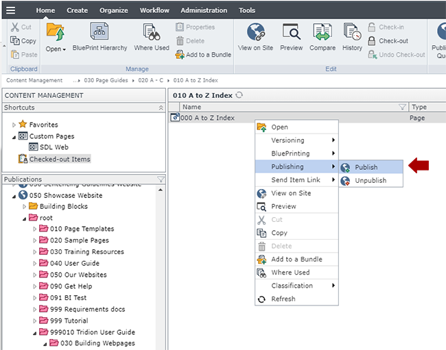
In the 050 section, navigate to the Flex Layout page you built in step 6, right-click and select Publishing > Publish.
Select the site you wish to publish to and click Publish. This will send the Flex Layout page to the publishing queue.
Verify the page looks like you want it to, and edit/republish as needed.
Technical Specifications
Below are the types of page templates that allow Article Spotlights, and the component templates and number of components for each type that can be inserted in the page.