Create Rotators
Below are instructions for creating a page with rotators.
Looking for help? Submit a Support Ticket and we will assist.
This optional header box, called a Toggle Box, can be used for highlighting whatever content you would like. This is a rich-text field, so you can add links, images, bullets, etc.
You can edit it through the Header component on your website.
Below are instructions for creating a page with rotators.
The first thing to build is a General Content component with the headline and introductory text for the page. Below are the steps for creating this component:
Before you can build your rotator components, you'll need to gather, resize, and upload the images you plan to use in your rotator.
Spend some time looking at the examples of rotators available for your website, and pick which one you'd like to use. Knowing with rotator you'll use will help guide which images you select for your slides, because you may need to focus on certain image shapes, such as long and narrow.
As a general rule of thumb, when picking the images for your rotator, images that are 1200 pixels wide will work fine for most rotators. The only exception is if you intend to create Jumbo Feature Rotators, in which case you'll want to look for images that are at least 2000 pixels wide.
The height of the image is flexible, you can choose what works best (rectangle, square, etc.) for the rotator you plan to create.
Once you've gathered all the images you want to use in your rotator, resize all the images so that they share the exact same height and width measurements in pixels. If you don't do this, your rotator (and webpage) will "bounce" as each rotator slide loads.
In Tridion, navigate to the 020 folder where you wish to store the images, and upload them. Get instructions for uploading multimedia components, if you need them.
You will need to make a separate component for each slide in your rotator. Follow the directions below to create the components.
Tip: You cannot have more than one rotating carousel on a page. Even if you try inserting the rotators at separate spots in the page, and give them different styles via component templates, the system will still mash all your rotators into one carousel. Some page layouts also restrict rotators to certain parts of the page, and will ignore where you place your components within the page.
Since rotators can only be used in Flex Layout pages, you will need to create Flex Row Configuration components for your page. Please refer to the page on Flex Row Configuration components, to learn more about options for laying out your page.
You will also need to create additional components for your page to complete your flex rows. Create the additional components at this time. Here is more information on possible component types you may want to include in your page:
When you've completed all the steps above, then all you need to do next is publish your page.
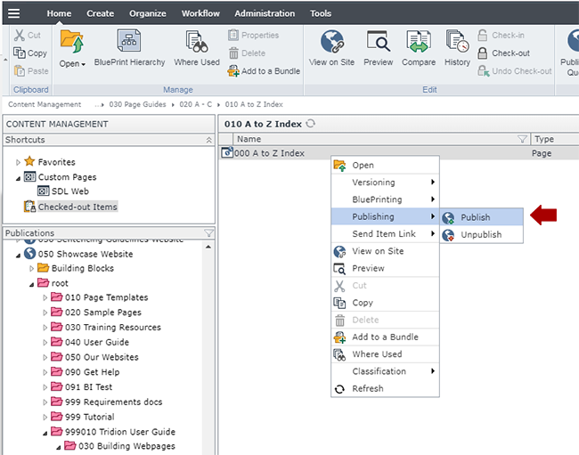
Navigate to the page you built in step 5, right-click on it and select Publishing > Publish.
Select the site you wish to publish to and click Publish. This will send the page to the publishing queue.
You will need to republish the navigation after publishing a new page.
Below are the types of components templates and page templates that can be used to create rotators, along with the component templates and number of components for each type that can be inserted in the page.
Component Type / Component Template | Accepted in Page Templates | Min/Max |
---|---|---|
General Content /
General Content /
General Content /
General Content /
General Content /
General Content /
General Content /
General Content /
|
|
0-1000 |