General Content component
The General Content component is a relatively simple component, with only 7 fields. However, the content in it can be rendered in numerous ways, as illustrated below in the Component Templates section.
Looking for help? Submit a Support Ticket and we will assist.
This optional header box, called a Toggle Box, can be used for highlighting whatever content you would like. This is a rich-text field, so you can add links, images, bullets, etc.
You can edit it through the Header component on your website.
The General Content component is a relatively simple component, with only 7 fields. However, the content in it can be rendered in numerous ways, as illustrated below in the Component Templates section.
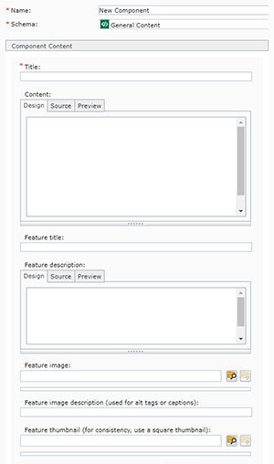
Below are the fields that make up a General Content component, and tips for completing them. Most of these fields are only used as needed, depending on which component template you pick. See the Component Templates section below for more guidance on when each field is needed.
The General Content component has 21 component templates, which render the component content in very different ways. Below are descriptions and examples of each component template, so you can decide which is best for the page you are building.
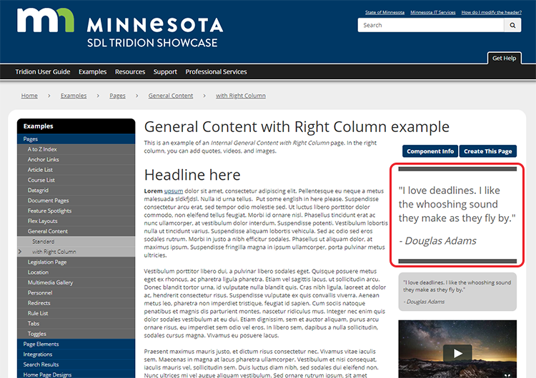
The Callout Box Quotes component template allows the page creator to add highlighted text quotes to the right column of a General Content page. Below is what a Callout Box Quote looks like, highlighted in red.
To create a Callout Box Quote for a page, you must complete the following fields in the General Content component:
Callout Box Quotes can only be used with the Internal General Content with Right Column page template.
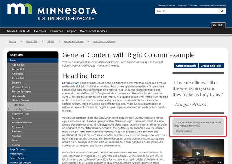
The Callout Box Sidebar Content component template allows the page creator to add highlighted text quotes to the right column of a General Content page. Below is what the Callout Box Sidebar Content looks like, highlighted in red.
To create a Callout Box Sidebar Content for a page, you must complete the following fields in the General Content component:
Callout Box Sidebar Content can only be used with the Internal General Content with Right Column page template.
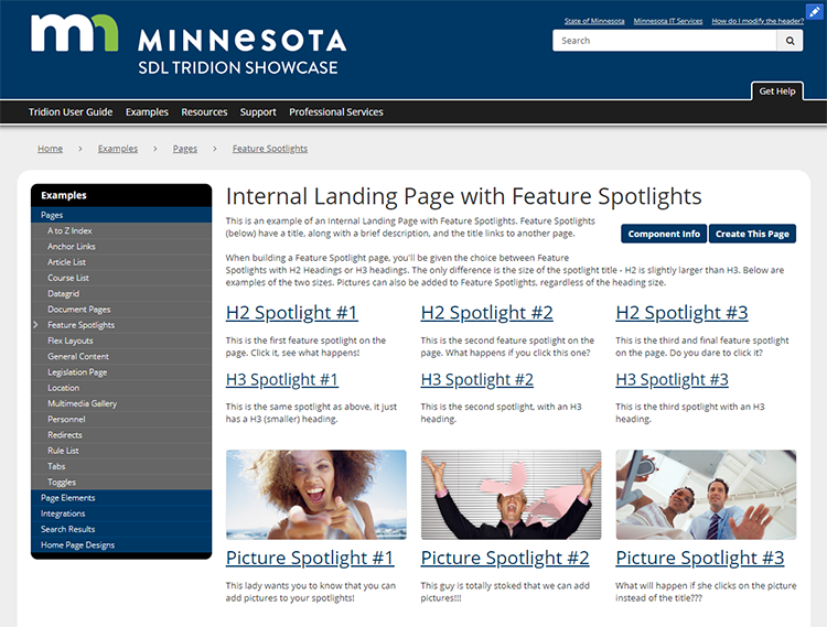
The Feature Spotlight (with H2 or H3 heading) component templates allows the page creator to add prominent links to other pages. Below is what a Feature Spotlight page looks like. It includes options for having Feature Spotlights with 2 different heading (aka title) sizes, and optional feature spotlight pictures.
To create a Feature Spotlight for a page, you must complete the following fields in the General Content component:
Tip: Make sure that you size all your Feature Spotlight images before uploading them into Tridion, and make sure all the images have the same heights and widths - otherwise you'll wind up with Feature Spotlights that are not uniform in appearance.
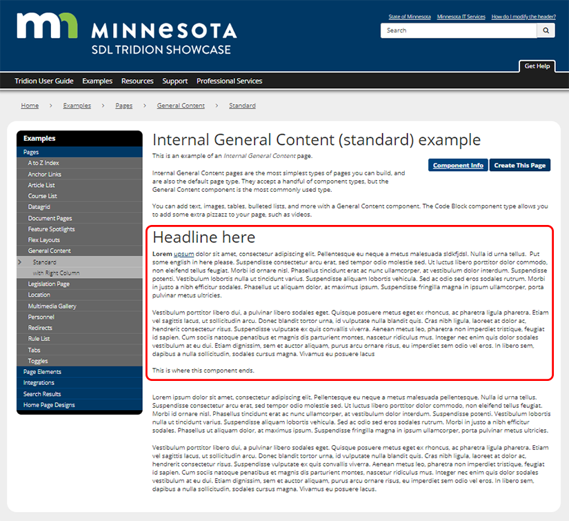
The General Content component templates allows the page creator to add a chunk of text to a page. The text can include images, tables, bulleted lists, links, and formatting. Highlighted below is a simple General Content component.
To create this, complete the following fields in a General Content component:
That's it for a General Content component! They're pretty simple.
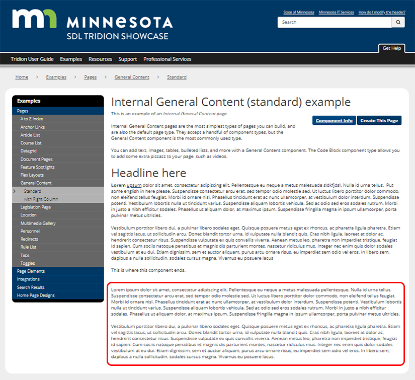
The General Content - no title component templates allows the page creator to add a chunk of text to a page, but without a headline. The text can include images, tables, bulleted lists, links, and formatting. You will find these useful when you need to break apart chunks of text to insert other components, such as videos. Highlighted below is a General Content - no title component.
To create this, complete the following fields in a General Content component:
That's it for a General Content - no title component! They're pretty simple.
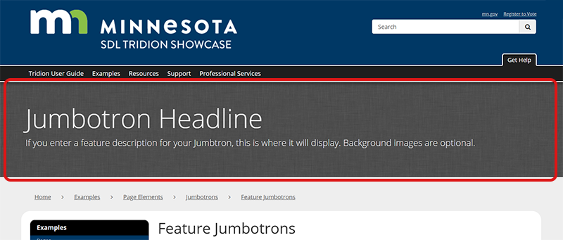
The Feature Jumbotron component templates allows you to create a content area at the top of your page, in which you can add a headline and some descriptive text. Highlighted below is a Feature Jumbotron.
To create this, complete the following fields in a General Content component:
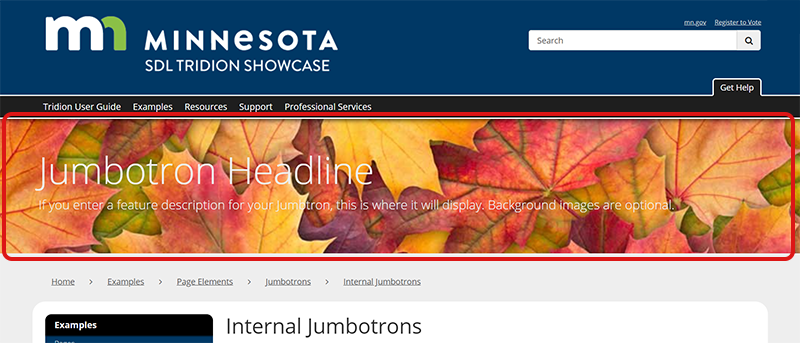
The Internal Jumbotron component templates allows you to create a bar across the top of the page where you can highlight content. You can include a headline, description, and optional background image. Highlighted below is an Internal Jumbotron.
To create this, complete the following fields in a General Content component:
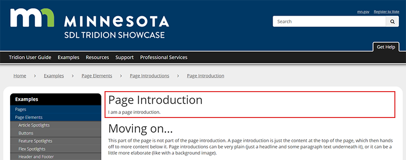
The Page Introduction component template creates a headline at the top of the page, with optional body text underneath. This component template is one of the ones you will use the most in Tridion. The optional body text can be brief, or many paragraphs. You can use the Page Introduction component template in place of a General Content component template on a page, but be forewarned that the Page Introduction component template will always display at the top of the published page, despite where you place the component when you insert it into the page. You can only have one Page Introduction component template per page.
Highlighted below is a Page Introduction.
To create this, complete the following fields in a General Content component:
Save and Close the component.
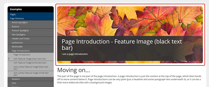
The Page Introduction - Feature Image (black text bar) component template creates a headline at the top of the page, with an optional description underneath, and a background image. For this component template, we recommend keeping your headline and description very brief. Highlighted below is a Page Introduction - Feature Image (black text bar).
To create this, complete the following fields in a General Content component:
Save and Close the component.
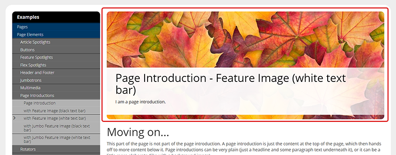
The Page Introduction - Feature Image (white text bar) component template creates a headline at the top of the page, with an optional description underneath, and a background image. For this component template, we recommend keeping your headline and description very brief. Highlighted below is a Page Introduction - Feature Image (white text bar).
To create this, complete the following fields in a General Content component:
Save and Close the component.
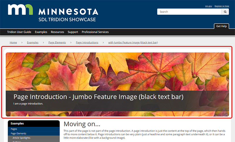
The Page Introduction - Jumbo Feature Image (black text bar) component template creates a headline at the top of the page, with an optional description underneath, and a background image. For this component template, we recommend keeping your headline and description very brief. Highlighted below is a Page Introduction - Jumbo Feature Image (black text bar).
To create this, complete the following fields in a General Content component:
Save and Close the component.
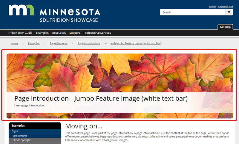
The Page Introduction - Jumbo Feature Image (white text bar) component template creates a headline at the top of the page, with an optional description underneath, and a background image. For this component template, we recommend keeping your headline and description very brief. Highlighted below is a Page Introduction - Jumbo Feature Image (white text bar).
To create this, complete the following fields in a General Content component:
Save and Close the component.
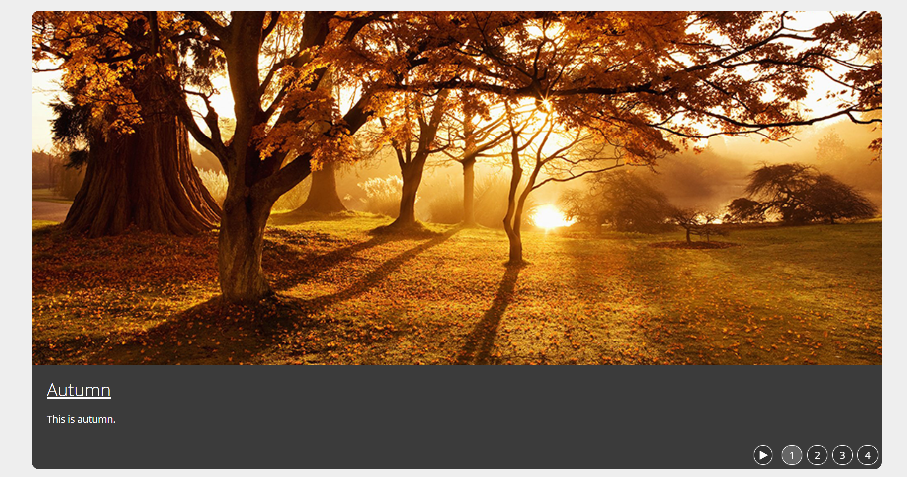
The Feature Rotator - Default Dark component template creates a rotating image carousel on the page. You can add a title and brief description to each rotator. Pictured below is what a Feature Rotator - Default Dark looks like.
To create this, complete the following fields in a General Content component:
Save and Close the component.
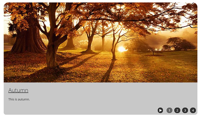
The Feature Rotator - Default Light component template creates a rotating image carousel on the page. You can add a title and brief description to each rotator. Pictured below is what a Feature Rotator - Default Light looks like.
To create this, complete the following fields in a General Content component:
Save and Close the component.
The Feature Rotator - Overlay Dark component template creates a rotating image carousel on the page. You can add a title and brief description to each rotator. Pictured below is what a Feature Rotator - Overlay Dark looks like.
To create this, complete the following fields in a General Content component:
Save and Close the component.
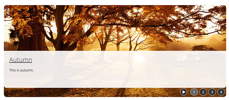
The Feature Rotator - Overlay Light component template creates a rotating image carousel on the page. You can add a title and brief description to each rotator. Pictured below is what a Feature Rotator - Overlay Light looks like.
To create this, complete the following fields in a General Content component:
Save and Close the component.
The Feature Rotator - Side Dark component template creates a rotating image carousel on the page. You can add a title and brief description to each rotator. Pictured below is what a Feature Rotator - Side Dark looks like.
To create this, complete the following fields in a General Content component:
Save and Close the component.
The Feature Rotator - Side Light component template creates a rotating image carousel on the page. You can add a title and brief description to each rotator. Pictured below is what a Feature Rotator - Side Light looks like.
To create this, complete the following fields in a General Content component:
Save and Close the component.
The Jumbo Feature Rotator component template creates a rotating image carousel at the top of the page, under the navigation bar. You can add a title and brief description to each rotator. Pictured below is what a Jumbo Feature Rotator looks like.
To create this, complete the following fields in a General Content component:
Save and Close the component.
The Jumbo Feature Rotator - Branded component template creates a rotating image carousel at the top of the page, under the navigation bar. You can add a title and brief description to each rotator. Pictured below is what a Jumbo Feature Rotator - Branded looks like.
To create this, complete the following fields in a General Content component:
Save and Close the component.
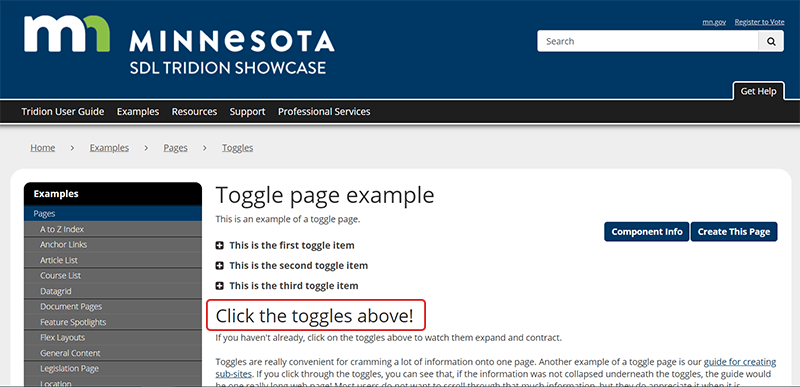
The Toggle List Section Heading component template allows you to insert sub-headings and text in between toggle items (or below them) on a Toggle page. Pictured below is a Toggle List Section Heading, circled in red.
To create this, complete the following fields in a General Content component:
Save and Close the component.