

Tips and tricks for working within SDL Tridion
Need help making your time within Tridion more effective and produce better results? You could probably use a few tips and tricks. In this new blog we've set up, we will be adding new tips and tricks for working within Tridion to make the most out of our implementation.
Creative commons photo credit: Dai Williams.
HELP! My flex rows aren't working right!
A few things that you need to remember when configuring your flex rows
3/24/2016 5:55:39 PM
Michael Tangen
I get it — you probably didn't have the time to watch all of the instructional videos on how to build flex page layouts — we all have a lot on our plates these days. But to get your flex pages looking and behaving correctly, you'll need to take a few moments out of your schedule and read through these tips.
Setting up your columns correctly
 I've seen this in one of our customer sites, where they didn't quite follow the instructions in the form field label where you select the layout for the columns in your row.
Instructions clearly say to pick the ASCII diagram that represents how you want your columns to be laid out. So in this example, the user chose the text "Three columns (thirds):" which one might assume is correct because it says "three columns (thirds)" — but that's not what the instructions call for.
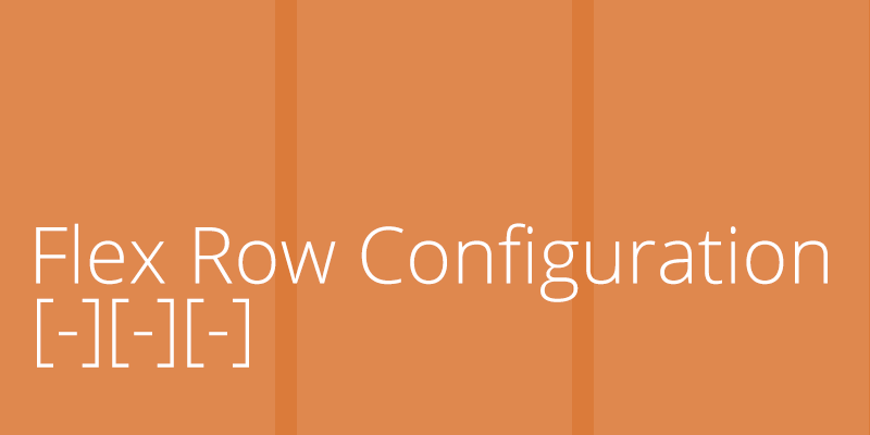
Instead, the correct setting would be to have chosen: [-][-][-], which is a text-only (ASCII) representation of how the columns would be distributed. All of the possible acceptable choices are as follows:
[----]
[-][--]
[--][-]
[-][---]
[--][--]
[---][-]
[--][-][-]
[-][--][-]
[-][-][--]
[-][-][-]
[-][-][-][-]
For your convenience, we've put text labels above each item to help describe how many columns there are and how they will be distributed. Unfortunately, SDL Tridion's GUI limits our ability to customize drop-down fields. We're unable to put option groups with each set of options, so instead we have to lump everything together — both the actual values we want you to select, and the option group labels above each set.
So don't choose the actual text description (e.g. "Two Columns (fourths):"), choose the ASCII visual representation. Should you make the mistake of choosing the wrong thing, the template will default to a setting of four columns distributed in fourths.
Make sure the number of components in your row matches your row configuration
If your setting is three columns, make sure you have three components in your row. If you have a two column configuration, make sure you have two components. If your row is one component short, your page will break.
If you absolutely must have a blank column with nothing in it (to function as a spacer), create a General Content component without any body copy in it, and use the component template "General Content - no title" and it will present a blank component for your column.
If you have one more component in your row than you have configured for (e.g. four components following a row configuration of three columns) that fourth component will be displayed on its own row and without any background color configuration (white, dark gray, or branded).
But the bigger take-away is: remember your component count must match your row configuration!
Accepted list of component presentations for flex pages
If you inserted a component, you published the page, and that component isn't displaying on your page — chances are you're using a template that is not supported on this page template. Here are the list of supported component templates for both flex page templates (main and internal):
- All page introduction and jumbotron templates
- All feature rotator templates (default dark/light, overlay dark/light, side dark/light),
- Feature Spotlight (with both H2/H3 heading)
- General Content
- General Content - no title
- Callout Box Quote
- Callout Box Sidebar Content
- Multimedia Item - inline with text
- Multimedia Item - inline no text
- Flex Spotlight
- Article Spotlight List
- Code Block
- Flex Row Configuration
- Caspio App
- Location
- Personnel List
- Personnel Detail
- Trumba Calendar
If you're using a template that's not listed above, your component will not display. We will likely add to this list at a later date, but in the meantime has everything you need to create a fantastic looking home page or custom layout for an internal page.
If you have additional questions, or if there are additional tips or tricks you'd like to see addressed, let us know!
General
Support
Help
Tips