
Development updates for Tridion
Periodically we add new functionality, enhance existing content types, or fix bugs that we find along the way. Stay connected with all the most recent updates to Tridion on our Development Updates blog.
Creative Commons photo credit: Richard Masoner
New fixes and enhancements for feature spotlights
Bringing alignment to new heights
3/22/2016 11:17:32 PM
Michael Tangen
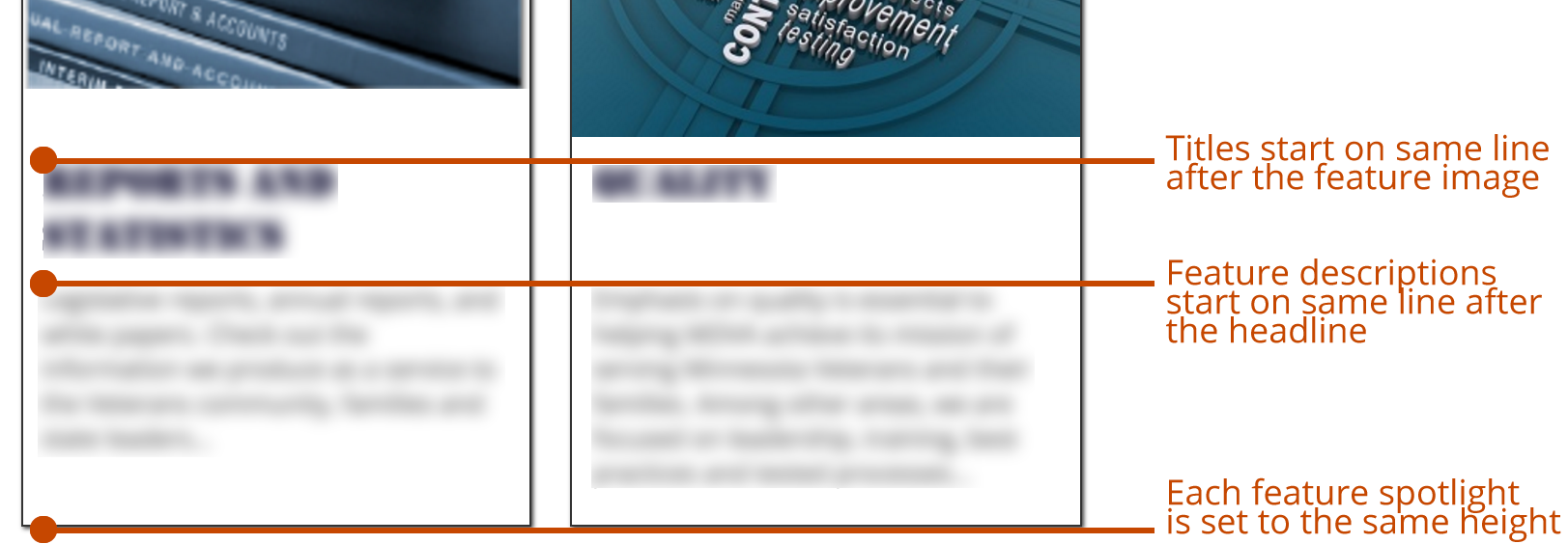
One of our goals with Feature Spotlights — a component template presentation of the General Content component type — was to make them more uniform and line up better. Well we've further improved how they appear and align on the Feature Spotlight internal page type.
Some necessary fixes
Previously, the jQuery was designed to go through a set of Feature Spotlight component presentations and align the feature descriptions so that they'd all start at the same point relative to the spotlight that had the tallest headline. Unfortunately the code was such that it wouldn't do it on a row-by-row basis. Instead, it would take the biggest headline of them all, and adjust all the other headlines to match that height. The bi-product was not ideal and produced results that we weren't happy with.
So in tandem with work we were doing for Minnesota Department of Veteran Affairs, which had unique formatting requirements for their Feature Spotlights, we both fixed the existing functionality and added a few items in there to help you have better looking feature spotlights.
Now the jQuery used to format feature spotlights performs its work on a row-by-row basis instead of the whole lot of them.
New formatting features
In addition to better aligning the feature descriptions up with each other, we've gone a step further with both the feature image thumbnails and the DIV element that contains each spotlight item. Now while we know you strive to ensure quality in all that you create, we know once in a while you may have feature images that are not quite the same dimensions. With that in mind, we evaluate each image on a row-by-row basis and add bottom margins to those feature images that aren't quite as tall as the tallest image present in each row. So if you have that one image that's just a bit taller than the others, your shorter images will be given a little extra bottom margin so that your headlines all start on the same horizontal plane.
Additionally, if you've got special formatting on the feature-spotlight-item container DIV for each spotlight item, you'll now notice that the containers for each row set now match, too. So if your feature spotlights have custom formatting applied to them — such as a background color — those spotlight items will all have the same height and match the height of the tallest item in each row.
You may not even notice that these changes are in place — it's that subtle. But it's those small touches that help make your good content look like great content.
General Updates
Fixes
New Features
Updates