skip to content
Primary navigation
finger pointing at screen

Development updates for Tridion

Periodically we add new functionality, enhance existing content types, or fix bugs that we find along the way. Stay connected with all the most recent updates to Tridion on our Development Updates blog.
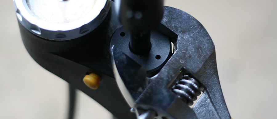
Creative Commons photo credit: Richard Masoner

New content type: modal overlay

Replace your GovDelivery subscribe modal with something a little more robust

3/24/2017 1:54:03 PM

Feature image for New content type: modal overlay

Michael Tangen

We recently discovered issues with GovDelivery's email subscription overlay, where the top navigation was bleeding through the modal, whereby creating undesirable outcomes. So to offer you more control while waiting for GovDelivery to fix this issue, we've created a brand new content type called "Modal Overlay", available now for your flex layout pages — both main and internal.

governor-subscribe-overlayCreating and using the modal is super easy and can be done in a matter of minutes; and for the more advanced users comfortable with managing your CSS, there are a variety of ID and class hooks that you can latch onto to fully tailor each modal. Let's take a look at the fields in the new Modal Overlay schema and cover what they do.

Modal Overlay fields

Modal Introduction Text — this is a rich text field that allows you to put in formatted text and images at the top of the modal. In the example of the Governor's Office modal, the state seal graphic and the opening two lines of text are in that top introduction field.

Modal Code — this is a text-only field that allows you to paste in your HTML from GovDelivery or other sources.  Please take care to use only well-formed HTML or this could cause your page to break.  Remember that we are using the Bootstrap framework, so consider using some of the classes and formatting options found in the Bootstrap documentation website. In the photo example, we're using a custom form built using the Bootstrap framework elements and are pointing to GovDelivery's website.

Modal Bottom Text — this is a rich text field that will populate beneath both the Introduction and Code sections.  This might be a nice spot to put links to disclaimers or supplemental information relevant to the modal. In this example photo, there is no bottom text.  It's an optional field and is not required.

Modal Name — this is a required field that assigns a unique name to your modal, which allows you the ability to place custom CSS formatting that applies to only that modal (or all modals that share that name).  Only alphanumeric characters and underscores _ are allowed — NO SPECIAL CHARACTERS OR SPACES ALLOWED.   Some example names:  

  • SubscribeModal 
  • Modal_Disclaimer
  • ModalWindow
  • modal_1

You would then use that unique name to hook onto with CSS.  So for our first example "SubscribeModal", your root level ID hook would be "#SubscribeModal".

Width — you have three options for the width of the modal: small (300 pixels wide), medium (600 pixels), and large (900 pixels). The default is set to medium.  Note that the height will automatically expand to fit all of your content.

Automatically Display — this boolean value lets you decide whether or not you want the modal to display when the page loads are not (default is set to true).  If you set it to false, a button will display instead, allowing the user to click on the button to launch the modal overlay.  Which then leads to our next field, Button Text.

Button Text — if you elect NOT to automatically display the modal overlay (set to false),  you will want to fill in this field with the text that you want to appear in the button.  You might use this to launch a privacy policy or more information.  Simply type in the text that you want to appear in the button.

Style — much like the flex row configuration, you have some base level formatting options that allow you to set the theme for the modal.  You can set it to "branded" (the dark Minnesota blue with white text), "dark-gray" with white text, "light-gray" with dark text, and "white" with dark text.  The default is set to "white".  In our photo example, the Governor's Office used the "branded" option.

Expiration — You have some level of control as to how often this modal overlay appears to the end-user. The current default is an expiration of 30 days, meaning that the modal won't display again for 30 days (unless the user clears out their cookies, browses from a different device, or browses in "incognito/private mode").  If you want the modal to display every time, set the numeric value to 0 (zero).

How to start using this content type for your website

If you haven't done so, please republish your core CSS page assemblies. We've added a new content LESS file for the modal overlay and it requires you to republish it for all of the default formatting to be included in on your website.

To use this content type, simply create a new component using the Modal Overlay schema, fill in the required fields, and enter in the desired content and/or HTML code for things like subscription forms. This information should suffice to get you going. Remember that this content type only works on Flex Layout pages. You cannot use this anywhere else at this time.

About the modal overlay's DOM structure

If you wish to dive deeper into formatting your modal overlay, we've provided the HTML structure below. It's comprised of a few ID and class values that you can latch onto and provide unique formatting to in your custom LESS file. But for most of our users, you do not need to worry about this.  Everything is already in place and you can start using this content type immediately after your CSS has been republished.  Here is the structure of the modal (note: where it says "ModalUniqueNameHere" — this is the unique name you assign your modal in the component):

<div class="modal fade" id="ModalUniqueNameHere" tabindex="-1" role="dialog" aria-labelledby="Modal_SubscribeLabel">
   <div class="modal-dialog modal-md" role="document">
     <div class="modal-content branded">
       <!-- the following tag is for screen readers only //-->
       <div class="sr-only" id="Modal_SubscribeLabel">Modal_Subscribe modal window</div>
       <div class="modal-close-button">
           <button type="button" class="btn btn-primary" aria-label="close_modal" data-dismiss="modal">
            <span class="fa fa-close" aria-hidden="true"></span><span class="sr-only" id="close_modal">close</span>
           </button>
       </div>
       <div class="modal-body">
         <div class="modal-intro">
               THIS IS WHERE YOUR INTRO COPY IS
         </div>
         <div class="modal-code">
               THIS IS WHERE THE FORM LIVES
         </div>
 
         <div class="modal-bottom">
               THIS IS WHERE YOUR BOTTOM RICH TEXT LIVES
         </div>
       </div>
     </div>
   </div>
</div>

General Updates

Change Log

New Features

Updates

back to top