Find the latest news from the Office of Accessibility. Once a month we will bring you tips, articles, and ways to learn more about digital accessibility. Want an easier way to stay informed? Subscribe to the Accessibility Newsletter!
Accessibility Considerations for Designing with Ligatures in InDesign and Illustrator
9/29/2021 3:35:21 PM

By Jeremy DePew, Senior Designer at Minnesota IT Services
Anyone who creates documents or uses graphic design software has probably encountered a typographic feature called ligatures. A common feature in OpenType fonts, ligatures are replacement characters for certain letter pairs, such as fi, fl, ff, ffi, ffl, etc. They can improve the appearance of characters that have features that visually collide when used next to each other. In the example above, the letters “f” and “i” display as distinctly separate characters (left), as well as in ligature form (right).
In the example where the characters are distinctly separate, the dot of the letter “i” awkwardly bumps into the ascender (top) of the letter “f.” In the ligature example:
You may not consciously think about ligatures as you type, since you can select characters individually and spell checkers don’t flag them as misspellings. However, there are some accessibility considerations that you should think about when you use them as you design documents, graphics, or websites.
This article will give a high-level overview of problems ligatures can cause, as well as provide some workarounds for solving those issues. These observations and suggestions are for Adobe InDesign and Adobe Illustrator, two common applications used by graphic designers.
When you increase the spacing between characters, many of us can more easily read content. We may be:
But for some people, the spacing is essential. This includes people that have a disability that impacts reading, such as people with dyslexia and some individuals that have had strokes or brain injuries. Accuracy and speed of reading increases for these people when document authors and designers follow readability best practices. In his article "A Guide to Understanding What Makes a Typeface Accessible," Gareth Ford Williams includes:
When you generate a PDF from InDesign or Illustrator for a document that uses ligatures, and then run an accessibility check on that PDF in Adobe Acrobat Pro, you may run into a “character encoding – failed” error. The Worldwide Web Consortium (W3C) describes character encoding as “a set of mappings between the bytes in the computer and the characters in the character set.” There are many different encoding types. The failure of a glyph (graphical depiction of a character) to map correctly could cause individual font glyphs to be displayed incorrectly or not at all in documents (discussed in PDF/A in a Nutshell - PDF). It could also potentially impact the ability of assistive technology to read or pronounce words correctly, even if they are visually present. For example, I saved a test PDF document from Illustrator containing three different words with ligatures. A JAWS screen reader (version 2021.2107.12) read:
In the testing I performed, PDFs containing ligatures generated from Adobe Illustrator consistently had character encoding errors.
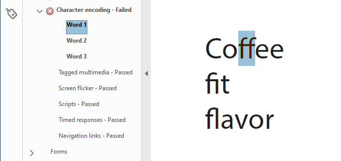
Figure 1 - Acrobat accessibility checker flagging a “character encoding – failed” error in a PDF exported from Illustrator.
Older versions of InDesign also caused this error in PDFs, though it wasn’t present in the most recent version of InDesign I tested with, version 16.3 x64.
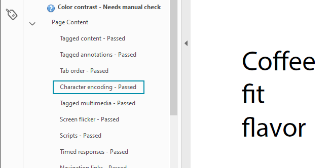
Figure 2 - Acrobat accessibility checker showing that character encoding passed in a PDF exported from InDesign version 16.3 x64.
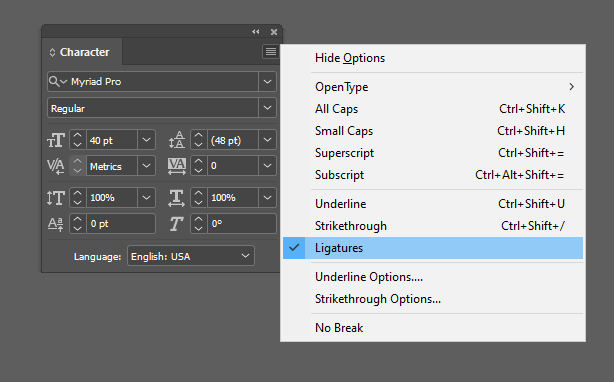
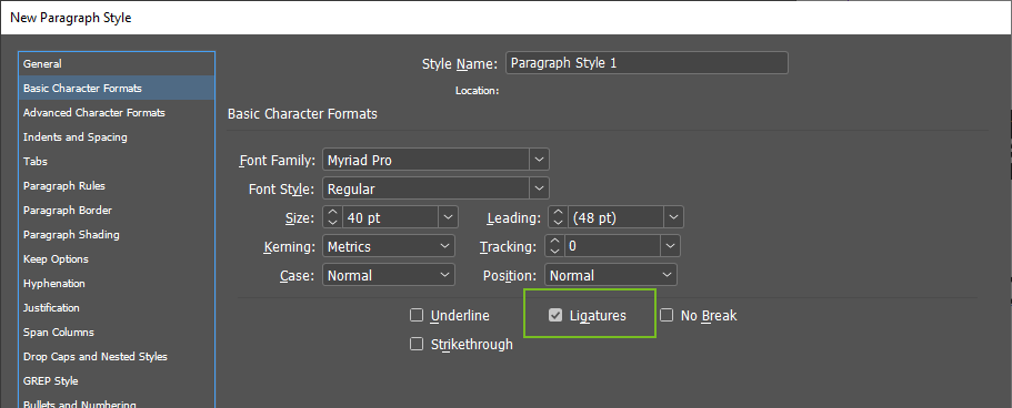
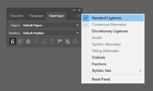
If you’re having trouble with character encoding issues in PDFs, or want to better support readers who need greater character separation, you can choose to turn the ligatures off. Your characters will then appear as individual letterforms and use the default kerning information (space between individual letters) that is built into the font.
You can easily remove the ligatures from selected text or entire text boxes. You can also define ligature activation through your styles. However, there is no apparent way to globally disable ligatures in Adobe Creative Cloud applications (such as through a setting in Preferences > Type).
Would you like to learn more about the accessibility work being done by Minnesota IT Services and the State of Minnesota? Once a month we will bring you more tips, articles, and ways to learn more about digital accessibility.
Accessibility
Accessibility