Component Template Options
The Flex Row Configuration has only one component template that can be applied to it, but the way the component renders depends on what settings you have applied. Below is one example of a Flex Row:

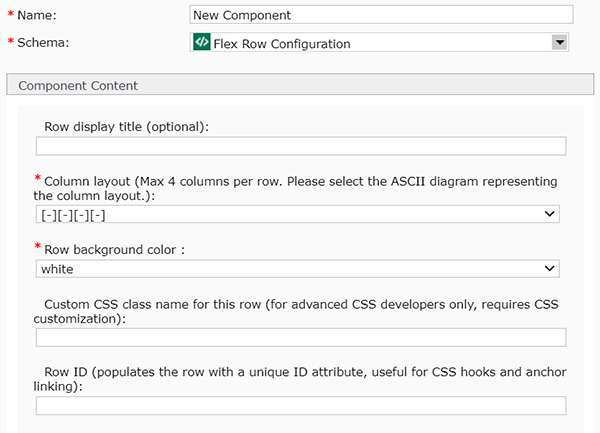
- Row Display Title: In the image above, there's a centered headline that reads "Additional Resources." This is what was entered in the Row Display Title field of the Flex Row Configuration component for this example row. This is how headlines entered in that field will appear (centered, with that font), although the color of the headline may vary depending on the background color selected. This field is optional, so if nothing had been entered in the Row Display Title field, no headline would have displayed.
- Row Background Color: In the image above, the background of the row is Minnesota's state branded blue. This is because "branded" was selected from the drop-down in the Row Background Color field of the Flex Row Configuration component for this example.
- Column Layout: In the image above, there are 4 columns (volunteer, national, partnerships, supplies). The 4 column format is what was selected in the Column Layout field of the Flex Row Configuration component for this example row.
More Examples of Flex Row Layouts
This is just one example of how a Flex Row Configuration component can render, and you are not limited to just this particular style. Some other pages with examples of flex row layouts include:
Hopefully these examples help you understand how Flex Row Configuration components work, and that you have many options for using them.
Important Tip About Using Flex Row Components
When using Flex Row Configurations, it is important to insert the number of components that match the number of columns you selected in the Column Layout field of the Flex Row Configuration component. These components must be inserted directly underneath the Flex Row Configuration component.
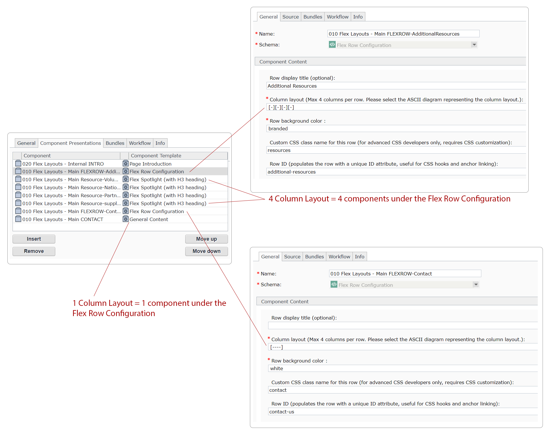
For example, using the illustration provided below, there are two Flex Row Configuration components that have been inserted into this webpage:
- The first one uses a 4-column layout, so there are 4 components that were inserted into the webpage directly after that Flex Row Configuration component. Those components are there to fill the 4 columns specified in the Flex Row Configuration.
- The second Flex Row Configuration component has just 1 column selected in the Column Layout field. Thus, in this case, only one component follows that Flex Row Configuration component
(If this image is difficult to read, click on it and a larger, zoomable version will appear.)

Exceptions to the Rule: Rotators
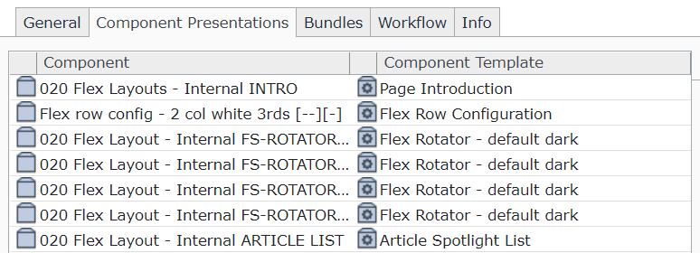
The only exception to this rule are for rotators. Since rotators are intended to have more than one slide, additional rotator slides are not included in the column count. See, for example, the screencap below. The Flex Row Configuration component shown uses a 2 column layout. In this case, the first rotator slide underneath it counts as filling one column, and the remaining 3 rotator slides are excluded from the column layout count. The 2nd remaining column is filled by an Article Spotlight List component.

What Happens If I Don't Insert the Correct Number of Components?
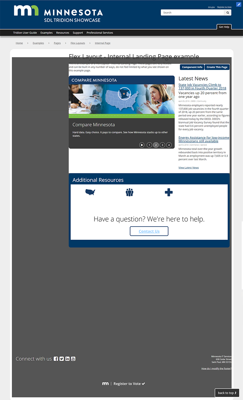
If you don't insert the correct number of components after a Flex Row Configuration, your page will look strange when it publishes. Below is one example of what it might look like, but your results may vary. Common indicators of a mismatch between your Flex Row Configuration components and the number of inserted components include:
- a footer that doesn't flow across the full width of the page (there are white bars along the left and right edges of the footer)
- missing left navigation
- a colored box behind your content, in the page area that is usually white and filled with the body of the webpage
- other general styling issues that affect the whole webpage (not just one small section of it)
