Find the latest news from the Office of Accessibility. Once a month we will bring you tips, articles, and ways to learn more about digital accessibility. Want an easier way to stay informed? Subscribe to the Accessibility Newsletter!
Understanding WCAG 2.1, 1.4.11 Color contrast for non-text items
6/15/2022 3:00:52 PM

By: Tamara Sawyer, Accessibility Coordinator, Minnesota Management and Budget
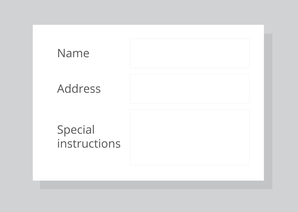
Web Content Accessibility Guidelines (WCAG) 2.1 success criteria 1.4.11 sets new standards for color contrast on non-text items. These items include form controls such as buttons and form fields, and colors used on charts and graphs. So why is this important? Here’s what a retiree had to say when they tried to fill out a form: “I couldn't use the ’Order Form’ — there were no text boxes. After a long call with customer service, I learned there were text box borders that were too light for me to see.”

After the form was updated with higher contrast, that same person stated: “It's easy for me to see all the icons and buttons and everything — even in the sunlight.”
This person’s experience shows us how important good color contrast is. But, you may say to yourself, I don’t create fillable forms for other people. Why should I worry about color contrast?
Well, summer is coming here to Minnesota (I sure hope it lands on a Saturday this year), and with so many working from home, it’s not uncommon for people to work outside. It’s a beautiful way to get through the workday. But have you noticed how hard it is to see your laptop, tablet, or mobile device screen in the sunlight? Many people have this problem, even when not in the sun, due to vision disabilities. This is especially common with our aging population, such as the person quoted above.
Therefore, when designing your documents, keep WCAG 2.1, 1.4.11 – Non-text Contrast in mind. Maybe you’re wondering how to know if you are meeting the new standard? First, don’t rely on your software to always comply with the new standards when adding things like form fields and buttons. Always use a color contrast checker to make sure the default colors have a minimum of 3:1 contrast ratio. Next, choose colors for charts and graphs that have good color contrast (again, using a color contrast checker). You can also use symbols and patterns in addition to color to make it easy for everyone to see and understand your graphs and charts. The Office of Accessibility lists some tools on their Web & Apps, Development/Testing page, under Color and Contrast. And lastly, visit the W3C website for more information on Understanding Success Criterion 1.4.11: Non-text Contrast. We can all do our part to keep Minnesota bright!
Would you like to learn more about the accessibility work being done by Minnesota IT Services and the State of Minnesota? Once a month we will bring you more tips, articles, and ways to learn more about digital accessibility.
Accessibility
Accessibility