
Page building
Dropdowns
Dropdown components allow users to choose from a set of options. Two types of dropdowns are available: navigation dropdowns and content-changing dropdowns.
- Navigation dropdowns link directly to destinations (URLs)
- Content-changing dropdowns display different content based on the user's selection
Available configurations and colorways
#configurations-colorwaysHow to build dropdowns
#how-to-buildExamples
#examplesHow to use each type of dropdown
Use a navigation dropdown when:
- Users need to choose one destination from a relatively large group of related options.
Use a content-changing dropdown when:
- Users need to select a category or situation in order to see information specific to that choice.
- Content-changing dropdowns work well for content such as program or eligibility information, where different users need different subsets of information.
Avoid
- Using a dropdown for only two or three simple choices that could be shown directly.
- Hiding a page's primary action inside a dropdown.
- Using vague option labels.
- Combining unrelated topics in one menu.
Available configurations and colorways
| Configurations | Colorways |
|---|---|
| [----] Full row - label and explainer text above full width dropdown | light, main, white |
| [--][-] Split row - label and explainer text on left, dropdown on right | light, main, white |
How to build navigation dropdowns
- Build your link components:
Navigation dropdowns use the "link" format of general content components. You can use components built in this way with: navigation dropdowns, sliders and quick links.
To create a link format general content component, fill in the fields in this way:
- Name: Include "Link" followed by the option title in the name of your component. For example: 110 Link: Apply for healthcare
- Title field: text displayed as the choice in the dropdown. Keep this text short such as "Apply for health care," "Find a contact," "Pay my premium" etc.
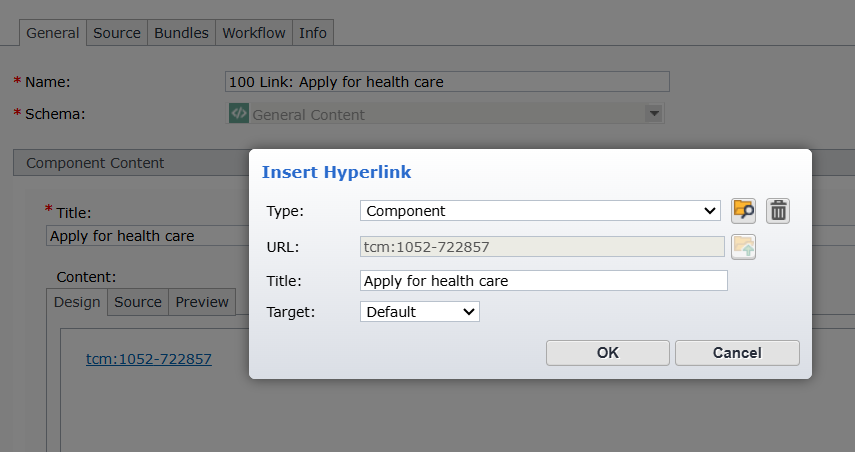
- Content field: contains the destination link. The link should be both the content of the field, and an active link. See screenshot.
- Make sure to include a title for your link as you would with a link in another area of the site.
- You can link to standard web addresses as well as other components or anchor links.
- Select the configuration and colorway that you wish to use.
- If you select a full row configuration:
- If you want to have a heading and/or explainer text, insert a heading row that corresponds with the colorway you are using, followed by the component that contains your heading and text content.
- Insert the dropdown row in the colorway you've chosen.
- Then, insert each of your link format general content components
- If you select a split row configuration:
- Insert the dropdown row in the colorway you've chosen.
- NOTE: The first component is automatically your heading and/or explainer text.
- Then, insert each of your link format general content components
- Navigation dropdowns work best with 5 - 15 options
How link format components should be set up
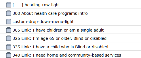
The pattern of components for a full row navigation drop down
Examples of navigation dropdowns
[----] Full row navigation dropdown, white colorway
This is an example of a [----] full row navigation dropdown in the white colorway
Example link 2
https://workplace.dhs.int.state.mn.us/SitePages/Home.aspxExample link 3
https://mn.gov/dhs/Example link 2
https://workplace.dhs.int.state.mn.us/SitePages/Home.aspxExample link 1
https://dhs.intranet.mn.gov/Examples of content-changing dropdowns
[----] Full row content-changing dropdown, light colorway
This is an example of a [----] full row content-changing dropdown in the light colorway
[--][-] Split row content-changing dropdown, white colorway
This is an example of a [--][-] split row content-changing dropdown in the white colorway