
Page building
Quick links
Quick links present important links as visually distinct options. They are useful when a user arrives on a page with a specific task or destination in mind.
The site supports both horizontal and vertical quick-link layouts, along with several visual treatments.
Available configurations and colorways
#configurations-colorwaysHow to build quick links
#how-to-buildExamples
#examplesUse quick links when
- A page has several high-priority destinations.
- Link choices can be described with short, clear labels, and/or need more text than a button can accomodate.
- Users are likely to scan the options rather than read them sequentially.
- The links represent related tasks or destinations.
Avoid
- Long paragraphs inside individual quick links.
- Mixing unrelated destinations in one quick-link group.
- Using several quick-link groups in succession without clear headings.
Available configurations and colorways
| Configurations | Colorways |
|---|---|
| Horizontal, three link cards to a row, max of nine total links may be used | important, light, main, white |
| [--][-] Vertical, text in wide column on left, links in narrow column on right | important, light, main, white |
How to build quick links
- Build your link components:
Navigation dropdowns use the "link" format of general content components. You can use components built in this way with: navigation dropdowns, sliders and quick links.
To create a link format general content component, fill in the fields in this way:
- Name: Include "Link" followed by the option title in the name of your component. For example: 110 Link: Apply for healthcare
- Title field: text displayed as the choice in the dropdown. Keep this text short such as "Apply for health care," "Find a contact," "Pay my premium" etc.
- Content field: contains the destination link. The link should be both the content of the field, and an active link. See screenshot.
- Make sure to include a title for your link as you would with a link in another area of the site.
- You can link to standard web addresses as well as other components or anchor links.
- Select the configuration and colorway that you wish to use.
- If you select a horizontal configuration:
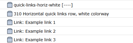
- Insert the horizontal quick links row in the colorway you've chosen.
- The first component you insert is automatically your heading and/or explainer text and will appear above your links.
- Then, insert each of your link format general content components.
- Horizontal quick links are displayed in rows of three and may have up to nine links.
- If you select a vertical configuration:
- Insert the vertical quick links row in the colorway you've chosen.
- The first component you insert is automatically your heading and/or explainer text and will appear in the wide left column beside your links.
- Then, insert each of your link format general content components
- Vertical quick links work best with 3 - 4 links.
Examples
Horizontal quick links row, white colorway
This is an example of a horizontal quick links row in the white colorway
Example link 1
https://dhs.intranet.mn.gov/Example link 2
https://workplace.dhs.int.state.mn.us/SitePages/Home.aspxExample link 3
https://mn.gov/dhs/Horizontal quick links row, light colorway
This is an example of a horizontal quick links row in the light colorway
Example link 3
https://mn.gov/dhs/Example link 2
https://workplace.dhs.int.state.mn.us/SitePages/Home.aspxExample link 1
https://dhs.intranet.mn.gov/Horizontal quick links row, main colorway
This is an example of a horizontal quick links row in the main colorway
Example link 3
https://mn.gov/dhs/Example link 2
https://workplace.dhs.int.state.mn.us/SitePages/Home.aspxExample link 1
https://dhs.intranet.mn.gov/Vertical quick links, coming soon!
Vertical quick links are in development and coming soon!