
Page building
Callout rows and boxes
Callout rows and boxes visually separate information from the surrounding page. They can contain headings, paragraphs, lists and other supporting content.
Callout rows present several related callouts in a shared row. The design supports contained items within a multi-column layout.
Available configurations and colorways
#configurations-colorwaysHow to build callouts
#how-to-buildExamples
#examplesUse a callout row when
- Several items have similar importance.
- Each item contains a comparable amount and type of information.
- Users benefit from seeing the items as a related group.
- Information deserves more attention than ordinary body content.
- Users need to notice an instruction, deadline, clarification or other important supporting information.
- A small group of related information benefits from being visually contained.
Avoid
- Putting most of a page inside callouts.
- Using callouts only to make a page look more visually interesting.
- Placing unrelated information in the same callout.
- Using several emphasized callouts at the same level, which can make it unclear what is actually important.
- Avoid forcing content into matching columns when the items differ significantly in complexity or length.
Available configurations and colorways
| Configurations | Colorways |
|---|---|
| [----] Full row | important, light, main, white |
| [--][-] Two columns - wide left | important, light, main, white |
| [-][--] Two columns - wide right | important, light, main, white |
| [-][-][-] Three columns | important, light, main, white |
How to build callouts
- Select the configuration and colorway that you wish to use.
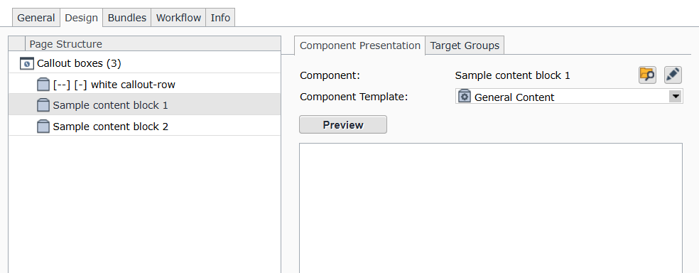
- Like normal flex row configurations, you will need one general component for each column in your configuration. The only difference is, in callouts, the columns are styled differently into "cards."
- For example: if you select this configuration: [--][-] Two columns - wide left, you need to follow the flex row configuration component with two general components as in the screenshot to the right.
Examples
[----] Full row, white colorway
This is an example of a [----] full row callout box in the white colorway
[----] Full row, important colorway
This is an example of a [----] full row callout box in the imporant colorway
Only use for: Important content such as application deadlines, common pitfalls of applications, etc
[--][-] Two columns - wide left, light colorway
This is an example of a [--][-] two columns, wide left callout row in the light colorway.
Lorem ipsum dolor sit amet, consectetuer adipiscing elit. Aenean commodo ligula eget dolor. Aenean massa. Cum sociis natoque penatibus et magnis dis parturient montes, nascetur ridiculus mus. Donec quam felis, ultricies nec, pellentesque eu, pretium quis, sem. Nulla consequat massa quis enim. Donec pede justo, fringilla vel, aliquet nec, vulputate eget, arcu.
Sample content block 1
Integer tincidunt. Cras dapibus. Vivamus elementum semper nisi. Aenean vulputate eleifend tellus. Aenean leo ligula, porttitor eu, consequat vitae, eleifend ac, enim. Aliquam lorem ante, dapibus in, viverra quis, feugiat a, tellus.
[-][--] Two columns - wide right, main colorway
This is an example of a [-][--] two columns - wide right callout row in the main colorway.
Sample content block 1
Integer tincidunt. Cras dapibus. Vivamus elementum semper nisi. Aenean vulputate eleifend tellus. Aenean leo ligula, porttitor eu, consequat vitae, eleifend ac, enim. Aliquam lorem ante, dapibus in, viverra quis, feugiat a, tellus.
[-][-][-] Three columns - white colorway
This is an example of a [-][-][-] three columns callout row in the white colorway
Sample content block 1
Integer tincidunt. Cras dapibus. Vivamus elementum semper nisi. Aenean vulputate eleifend tellus. Aenean leo ligula, porttitor eu, consequat vitae, eleifend ac, enim. Aliquam lorem ante, dapibus in, viverra quis, feugiat a, tellus.
Sample content block 1
Integer tincidunt. Cras dapibus. Vivamus elementum semper nisi. Aenean vulputate eleifend tellus. Aenean leo ligula, porttitor eu, consequat vitae, eleifend ac, enim. Aliquam lorem ante, dapibus in, viverra quis, feugiat a, tellus.