
Page building
Toggles
Now, you can have toggles on a page without using a toggle page template!
Several types of toggles are available:
- Nested toggles create a box with main content, followed by a series of expandable toggles
- Nested toggles are available in: full row; two columns - both toggles; and two columns - left side text, right side toggles
- Full row single toggles (accordions) create a single toggle that opens to reveal text
Consider if the information in the toggle should become its own page instead of a series of toggles if the content is longer than a couple of paragraphs or a short bullet list.
Available configurations and colorways
#configurations-colorwaysHow to build toggles
#how-to-buildExamples
#examplesUse toggles when
Use nested toggles when
- Users need to browse several related topics.
- Each topic can be summarized with a concise heading.
- Users are unlikely to need all of the information at once.
Use a full row single toggle (accordion) when
- The heading gives users enough information to decide whether they need the content.
- The information is useful to some users but not essential for everyone.
- Several related expandable items need to appear together.
Avoid
- Grouping information that doesn't fit one idea
- Putting more than a couple of paragraphs or a bulleted list in a toggle
- Users must open every item to understand the page.
- The information is essential to completing the primary task.
Do not use a full row single toggle (accordion) when
- The content is short enough that displaying it normally would be easier.
- Hiding the information would make it harder to discover.
Keep accordion headings short and descriptive. Users should be able to predict what they will find before expanding an item.
Available configurations and colorways
| Configurations | Colorways |
|---|---|
| [----] Full row nested | important, light, main, no border, sm-box, white |
| [----] Full row single (accordion) | important, light, main, white |
| [--][--] Two columns, both toggles | important, light, main, white |
| [--][--] Two columns, left text right toggles | important, light, main, white |
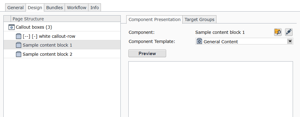
How to build toggles
- Select the configuration and colorway that you wish to use.
- If you select nested toggles:
- Insert the nested toggles row in the colorway you've chosen.
- The first component you insert is automatically your heading and/or explainer text and will appear above your toggles.
- Then, insert each of the general content components that contain the toggle content.
- If you select full row single (accordion) toggles:
- Insert the full row single toggle row in the colorway you've chosen.
- Then, insert your general content component.
Examples
[----] Nested toggle, no border colorway
This is an example of a [----] full row nested toggle in the no border colorway
Sample content block 3
Integer tincidunt. Cras dapibus. Vivamus elementum semper nisi. Aenean vulputate eleifend tellus. Aenean leo ligula, porttitor eu, consequat vitae, eleifend ac, enim. Aliquam lorem ante, dapibus in, viverra quis, feugiat a, tellus.
Sample content block 2
Integer tincidunt. Cras dapibus. Vivamus elementum semper nisi. Aenean vulputate eleifend tellus. Aenean leo ligula, porttitor eu, consequat vitae, eleifend ac, enim. Aliquam lorem ante, dapibus in, viverra quis, feugiat a, tellus.
Sample content block 1
Integer tincidunt. Cras dapibus. Vivamus elementum semper nisi. Aenean vulputate eleifend tellus. Aenean leo ligula, porttitor eu, consequat vitae, eleifend ac, enim. Aliquam lorem ante, dapibus in, viverra quis, feugiat a, tellus.
[----] Nested toggle, small box colorway
This is an example of a [----] full row nested toggle in the small box colorway
Use only for: when you have many toggles as for a FAQ section.
Sample content block 3
Integer tincidunt. Cras dapibus. Vivamus elementum semper nisi. Aenean vulputate eleifend tellus. Aenean leo ligula, porttitor eu, consequat vitae, eleifend ac, enim. Aliquam lorem ante, dapibus in, viverra quis, feugiat a, tellus.
Sample content block 2
Integer tincidunt. Cras dapibus. Vivamus elementum semper nisi. Aenean vulputate eleifend tellus. Aenean leo ligula, porttitor eu, consequat vitae, eleifend ac, enim. Aliquam lorem ante, dapibus in, viverra quis, feugiat a, tellus.
Sample content block 1
Integer tincidunt. Cras dapibus. Vivamus elementum semper nisi. Aenean vulputate eleifend tellus. Aenean leo ligula, porttitor eu, consequat vitae, eleifend ac, enim. Aliquam lorem ante, dapibus in, viverra quis, feugiat a, tellus.
[----] Nested toggle, white colorway
This is an example of a [----] full row nested toggle in the white colorway
Sample content block 3
Integer tincidunt. Cras dapibus. Vivamus elementum semper nisi. Aenean vulputate eleifend tellus. Aenean leo ligula, porttitor eu, consequat vitae, eleifend ac, enim. Aliquam lorem ante, dapibus in, viverra quis, feugiat a, tellus.
Sample content block 2
Integer tincidunt. Cras dapibus. Vivamus elementum semper nisi. Aenean vulputate eleifend tellus. Aenean leo ligula, porttitor eu, consequat vitae, eleifend ac, enim. Aliquam lorem ante, dapibus in, viverra quis, feugiat a, tellus.
Sample content block 1
Integer tincidunt. Cras dapibus. Vivamus elementum semper nisi. Aenean vulputate eleifend tellus. Aenean leo ligula, porttitor eu, consequat vitae, eleifend ac, enim. Aliquam lorem ante, dapibus in, viverra quis, feugiat a, tellus.
[----] Nested toggle, main colorway
This is an example of a [----] full row nested toggle in the main colorway
Sample content block 3
Integer tincidunt. Cras dapibus. Vivamus elementum semper nisi. Aenean vulputate eleifend tellus. Aenean leo ligula, porttitor eu, consequat vitae, eleifend ac, enim. Aliquam lorem ante, dapibus in, viverra quis, feugiat a, tellus.
Sample content block 2
Integer tincidunt. Cras dapibus. Vivamus elementum semper nisi. Aenean vulputate eleifend tellus. Aenean leo ligula, porttitor eu, consequat vitae, eleifend ac, enim. Aliquam lorem ante, dapibus in, viverra quis, feugiat a, tellus.
Sample content block 1
Integer tincidunt. Cras dapibus. Vivamus elementum semper nisi. Aenean vulputate eleifend tellus. Aenean leo ligula, porttitor eu, consequat vitae, eleifend ac, enim. Aliquam lorem ante, dapibus in, viverra quis, feugiat a, tellus.
[----] Nested toggle, light colorway
This is an example of a [----] full row nested toggle in the light colorway
Sample content block 3
Integer tincidunt. Cras dapibus. Vivamus elementum semper nisi. Aenean vulputate eleifend tellus. Aenean leo ligula, porttitor eu, consequat vitae, eleifend ac, enim. Aliquam lorem ante, dapibus in, viverra quis, feugiat a, tellus.
Sample content block 2
Integer tincidunt. Cras dapibus. Vivamus elementum semper nisi. Aenean vulputate eleifend tellus. Aenean leo ligula, porttitor eu, consequat vitae, eleifend ac, enim. Aliquam lorem ante, dapibus in, viverra quis, feugiat a, tellus.
Sample content block 1
Integer tincidunt. Cras dapibus. Vivamus elementum semper nisi. Aenean vulputate eleifend tellus. Aenean leo ligula, porttitor eu, consequat vitae, eleifend ac, enim. Aliquam lorem ante, dapibus in, viverra quis, feugiat a, tellus.
Sample content block 3
Integer tincidunt. Cras dapibus. Vivamus elementum semper nisi. Aenean vulputate eleifend tellus. Aenean leo ligula, porttitor eu, consequat vitae, eleifend ac, enim. Aliquam lorem ante, dapibus in, viverra quis, feugiat a, tellus.
Sample content block 2
Integer tincidunt. Cras dapibus. Vivamus elementum semper nisi. Aenean vulputate eleifend tellus. Aenean leo ligula, porttitor eu, consequat vitae, eleifend ac, enim. Aliquam lorem ante, dapibus in, viverra quis, feugiat a, tellus.
Sample content block 1
Integer tincidunt. Cras dapibus. Vivamus elementum semper nisi. Aenean vulputate eleifend tellus. Aenean leo ligula, porttitor eu, consequat vitae, eleifend ac, enim. Aliquam lorem ante, dapibus in, viverra quis, feugiat a, tellus.
Sample content block 3
Integer tincidunt. Cras dapibus. Vivamus elementum semper nisi. Aenean vulputate eleifend tellus. Aenean leo ligula, porttitor eu, consequat vitae, eleifend ac, enim. Aliquam lorem ante, dapibus in, viverra quis, feugiat a, tellus.
Sample content block 2
Integer tincidunt. Cras dapibus. Vivamus elementum semper nisi. Aenean vulputate eleifend tellus. Aenean leo ligula, porttitor eu, consequat vitae, eleifend ac, enim. Aliquam lorem ante, dapibus in, viverra quis, feugiat a, tellus.
Sample content block 1
Integer tincidunt. Cras dapibus. Vivamus elementum semper nisi. Aenean vulputate eleifend tellus. Aenean leo ligula, porttitor eu, consequat vitae, eleifend ac, enim. Aliquam lorem ante, dapibus in, viverra quis, feugiat a, tellus.
Sample content block 3
Integer tincidunt. Cras dapibus. Vivamus elementum semper nisi. Aenean vulputate eleifend tellus. Aenean leo ligula, porttitor eu, consequat vitae, eleifend ac, enim. Aliquam lorem ante, dapibus in, viverra quis, feugiat a, tellus.
Sample content block 2
Integer tincidunt. Cras dapibus. Vivamus elementum semper nisi. Aenean vulputate eleifend tellus. Aenean leo ligula, porttitor eu, consequat vitae, eleifend ac, enim. Aliquam lorem ante, dapibus in, viverra quis, feugiat a, tellus.
Sample content block 1
Integer tincidunt. Cras dapibus. Vivamus elementum semper nisi. Aenean vulputate eleifend tellus. Aenean leo ligula, porttitor eu, consequat vitae, eleifend ac, enim. Aliquam lorem ante, dapibus in, viverra quis, feugiat a, tellus.
Sample content block 3
Integer tincidunt. Cras dapibus. Vivamus elementum semper nisi. Aenean vulputate eleifend tellus. Aenean leo ligula, porttitor eu, consequat vitae, eleifend ac, enim. Aliquam lorem ante, dapibus in, viverra quis, feugiat a, tellus.
Sample content block 2
Integer tincidunt. Cras dapibus. Vivamus elementum semper nisi. Aenean vulputate eleifend tellus. Aenean leo ligula, porttitor eu, consequat vitae, eleifend ac, enim. Aliquam lorem ante, dapibus in, viverra quis, feugiat a, tellus.
Sample content block 1
Integer tincidunt. Cras dapibus. Vivamus elementum semper nisi. Aenean vulputate eleifend tellus. Aenean leo ligula, porttitor eu, consequat vitae, eleifend ac, enim. Aliquam lorem ante, dapibus in, viverra quis, feugiat a, tellus.