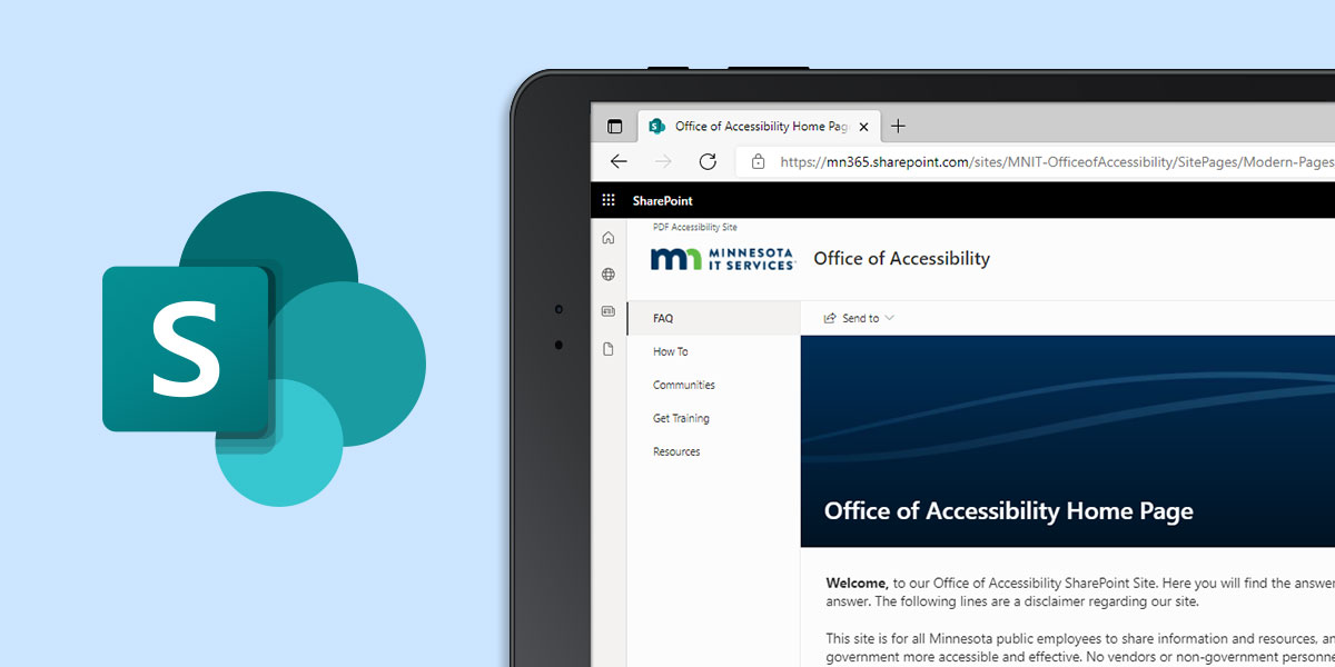
Creating More Accessible SharePoint Sites
11/16/2021 11:35:21 AM
By Jennie Delisi, Office of Accessibility
You may be using a SharePoint site to help your team:
A great goal for your SharePoint site is to help your site visitors:
Can you do this and be digitally inclusive?
It may surprise you to find out that achieving your site goals can also create a more digitally inclusive space.
You begin by answering some questions about the site:
Plan your SharePoint communication site has great tips for those starting a new site, or those who want to revisit and improve a site they already have. When you plan the layout and content, here are some tips to help you create with accessibility in mind.
Color can be really helpful on a SharePoint site. Color:
Some of your site visitors may not be able to perceive color. Others may need to view your page in different ways.
Too many things on the page will make it difficult for some people to find what they need. Others may find a cluttered page overwhelming. Both groups may find other ways to get to the information instead of using this page. That may prevent them from accessing the latest information you are sharing.
A few steps can help people more quickly find what they need:
Many people use magnification these days for a variety of reasons:
While digital fonts generally magnify well when zooming in, images depend on the quality of the picture or icon used. Select images considering the needs of those that will zoom in:
Microsoft has been working to build more accessibility into SharePoint. Older interfaces may not support navigation as well for people using assistive technologies. They do not include some important accessibility improvements built into the more modern interface features.
And it may be hard to tell which version you have.
Everybody uses links. Your goals should include using text that describes what they will do:
A plain URL link when sharing information in a digital space is a throwback to 1999!
Some tips:
Ensure everyone gets the message. You are using those graphics to communicate. For those who cannot see the page, or need the information in text, add concise and descriptive alternative text. When using complex graphics (like busy charts), in addition to the alternative text:
The name of your site, your pages, your documents - each helps people find what they need.
Remember:

When updating a SharePoint site you may encounter older pages and components. Also, you may want to experiment. Just take care to not break the built-in accessibility.
As you design and select your layout:
Some SharePoint interfaces have systems in place that automatically assign heading levels of some text on the page. An example: the name of the page is sometimes coded as a first level heading (H1). Some of the interfaces take all headings in the content area and demote them one level. This makes the H1 you styled become an H2, the H2 become an H3. You may not realize this unless you test. Using a tool like WAVE will help you run a quick test to ensure the structure you want to communicate is shared as you intend.
Planning, then designing and testing is a great way to begin improving digital inclusion. If digital accessibility is a new skill for you, welcome!
Some places to start:
Would you like to learn more about the accessibility work being done by Minnesota IT Services and the State of Minnesota? Once a month we will bring you more tips, articles, and ways to learn more about digital accessibility.
Accessibility
Accessibility
